Button
For Use in the Main Content Area, a container in the full-width area, or in the Sidebar WYSIWYG area.
Easily draw attention to a call-to-action by adding a button.
Button example
Visual demo
Widget standards
A layout is NOT needed for this widget.
Do:
- Limit the number of words on the button.
- Buttons may be maroon, gold, or white. Please use your best judgment when selecting the color and size.
- For consistent size across buttons, select the "full-width" button option.
Do NOT:
- Stack more than two button widgets on top of each other.
- Create excessively long calls to action. Be concise and direct your audience.
Written instructions
1. Find the button widget and drag it over into the desired container on your page.

2. Click on Create Content.

3. Select the 'Template' of the button.

4. Enter the link text.

5. Enter the ADA link text.

6. Add the link URL to the box, if it is an external page, check the box for speedbump.

7. Click Save.

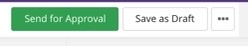
Save and send
- If you'd like to continue working on this page, but need to save your progress, click Save as Draft.
- If you're finished making changes to the page, and the page is ready for review, click Send for Approval.