Tabbed Callout Slider
For use in Full-Width containers only.
The Tabbed Callout Slider widget is good to use for categories, glossaries or any time users need information on a few key topics. It features the ability to organize a list of short-form content in a small space with links and images.
Tabbed Callout Slider screenshot
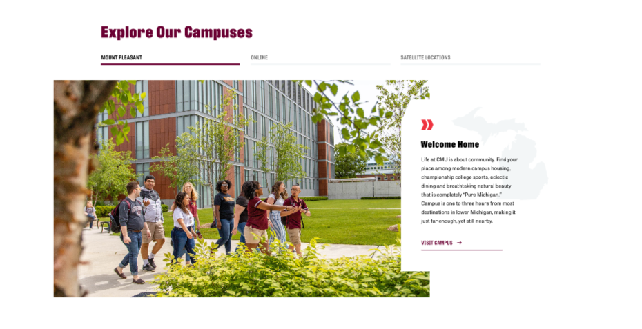
Visual demo
Add scribe here.
Widget standards
A layout is needed for this widget.
Do:
- Limited to three tabs.
- Background Image Size: 1200 x 900 - Ratio: 3:2
- Card Image Size: 500x500 - Ratio: 1:1.
- For Card Image, you must use a black .svg file only. Use only if you want a background image in the text box. (i.e. see the image of Michigan in the text box in the screen capture above).
Do NOT:
Written instructions
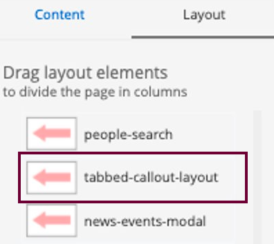
Add the layout
- Click the Layout tab on the right of the page.
- Add the tabbed-callout-layout to the page.
- Note: Be sure the container you are adding the tabbed-callout-layout is full-width, meaning it spans the entire width of the page.
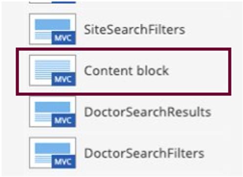
Add widgets
- Add Content Block widget to the top container of the tabbed-callout-layout.
- Add TabbedCallout widgets to the bottom containers of the tabbed-callout-layout widget.
- Note: Two or three TabbedCallout widgets are recommended.
Build widgets to specifications
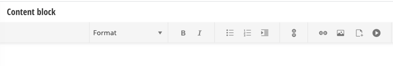
Edit content block
Enter Call to Action text.- Recommendation: Max 50 characters.
Edit each TabbedCallout
1. Template: Card.
2. Tab Title: Enter heading text.
a. Recommend max 50 characters.
3. Heading: Enter description text.
a. Recommend max 75 characters.
4. Description: Enter your descriptive text here.
a. Recommend max 200 characters.
5. BG Image: Select image (.png file) from library 1200x900 3:2.
6. Card Image: Use only if you want a background image in the text box. (i.e. see the image of Michigan in the text box in the screen capture above). Select a black .svg image by going into the correct folder and finding the appropriately sized image to select. Only a black .svg image will work for this card image.
Primary Link
7. Link Text: Enter your Call To Action link text.
a. Recommend max 30 characters.
8. Link Target: Select your option based on criteria:
a. Same Window: for internal CMU pages.
b. New Window: for external pages not within cmich.edu.
9. Link ADA title: Enter your link text for ADA compliance.
10. Link to: Choose the appropriate selection:
a. Pages within the site.
i. Choose select.
ii. This will take you to the page tree to select the correct page you wish to link to.
b. External URL: Enter the full URL of an external page.
Save.

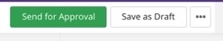
Save and send
- If you'd like to continue working on this page, but need to save your progress, click Save as Draft.
- If you're finished making changes to the page, and the page is ready for review, click Send for Approval.