Tabbed Content
For use in main content areas; not for use in sidebars or narrow columns/grids
The Tabbed Content widget can be used to organize and display a list of short-form content in horizontal or vertical formats. This widget is good for categories, glossaries, or any time users need information on a few key topics.
TabToAccordion (horizontal): tabs are horizontal with related content displayed underneath.
Tabbed Content example
Visual demo
Widget standards
A layout is needed for this widget.
Do:
- Use this widget to guide users to additional information or details.
- Use this widget judiciously.
- Use 3-5 tabs or accordions per set.
Do NOT:
- Include content over 1,000 characters including spaces.
- Add images or videos to tabs.
- Use this widget to "hide" important content, try to satisfy a desire for "movement," or to make long, scroll-intensive pages seem otherwise.
Written instructions
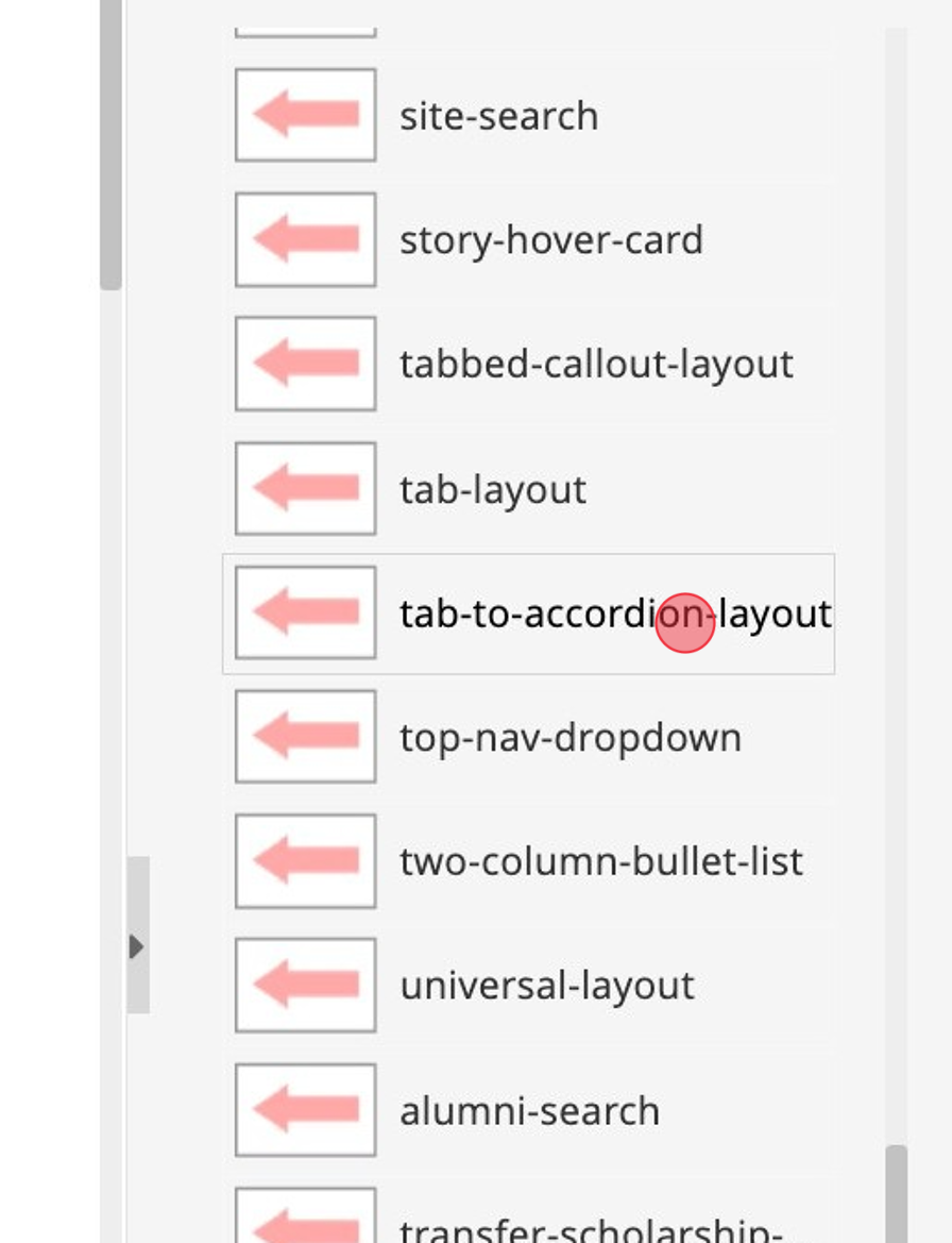
1. Click "tab-to-accordion-layout".
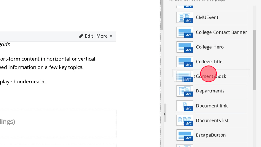
2. Click Content and select the "Content block". Add it to the Content Block Area (Headings) section.
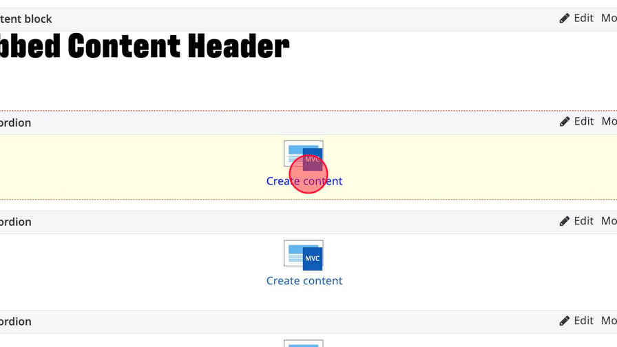
3. Add the Accordion widget to the Tab to Accordions section. There should be 3-5 accordions per layout.

4. Click "Edit" in the Content Block to add a header.

5. Add the Header text and save.

6. Click "Create content" on the accordion widget.
7. Click this dropdown and select TabToAccordion.

8. Click the "Heading" field and add the Tab Header.

9. Click the content area to add text to the tab. Image and videos are not allowed.

Alert! Optional buttons: Skip to Step 13 if you are not linking from your accordion.
10. Add the link text.

11. Click the "Link ADA Title" field and add descriptive text to explain where the link is leading the user.

12. Choose your link type. Page within the site... Select the page within Sitefinity. External URL: Include full URL of links outside of cmich.edu, check the display Speedbump box. Choose a document: Select a document that has been uploaded to the DAM.

13. Click "Save".

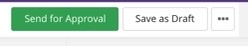
Save and send
- If you'd like to continue working on this page, but need to save your progress, click Save as Draft.
- If you're finished making changes to the page, and the page is ready for review, click Send for Approval.