Image Card Callout
For use in the full-width and main content areas.
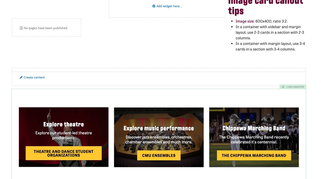
The Image Card Callout is used to display links in a visually appealing way. The widget uses an image for hte background and a gray area for link text.
Example with sidebar:


Example without sidebar:


Visual demo
Widget standards
The Card Wrapper layout is needed for this widget.
Do:
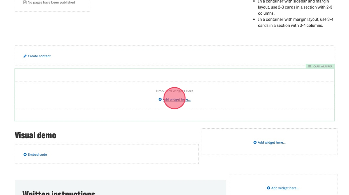
- Image size: 600x400, ratio 3:2.
- In a container with sidebar and margin layout, use 2-3 cards in a section with 2-3 columns.
- In a container with margin layout, use 3-4 cards in a section with 3-4 columns.
- Carefully consider what content you want to highlight for your users.
Do NOT:
- Add text that is longer than the character field. The text will obscure the background image.
- Use the image card callout in place of text paired with a button or hyperlink.
Written instructions
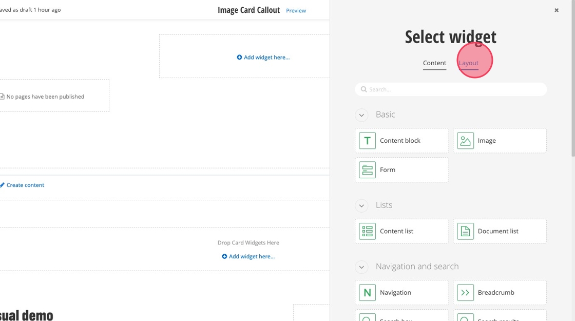
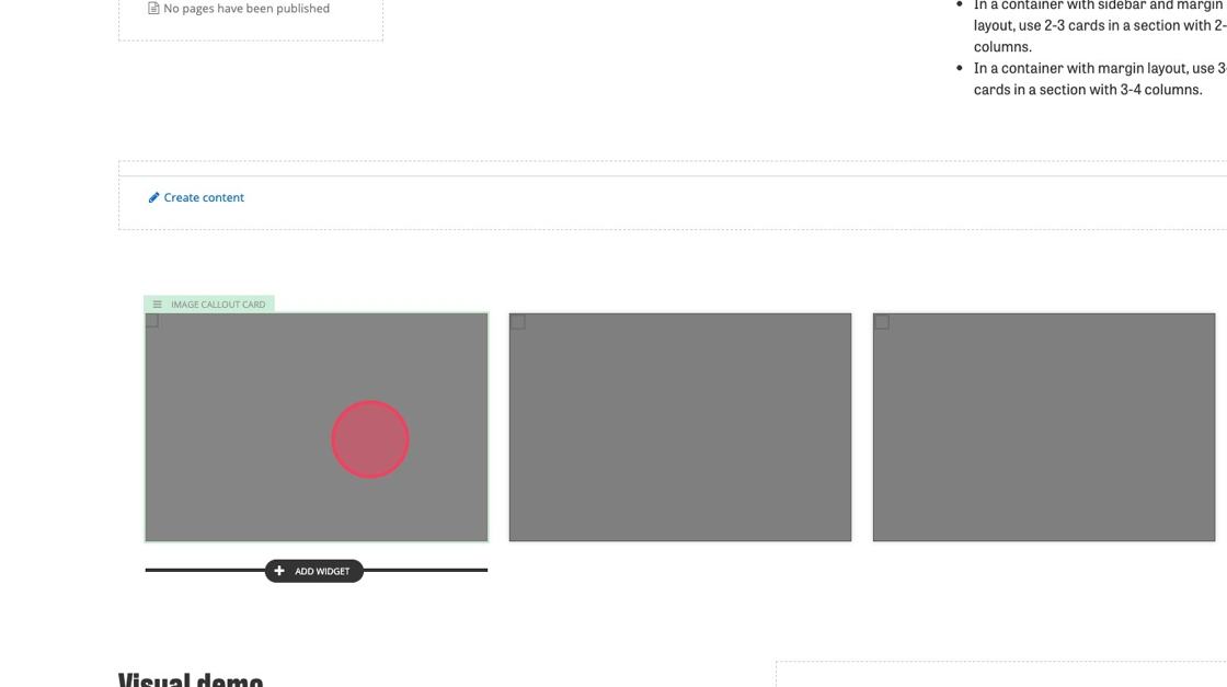
1. Click "+ Add widget"
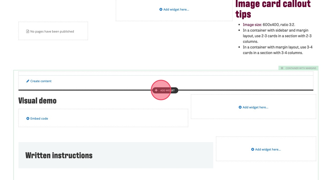
2. Click "Layout"
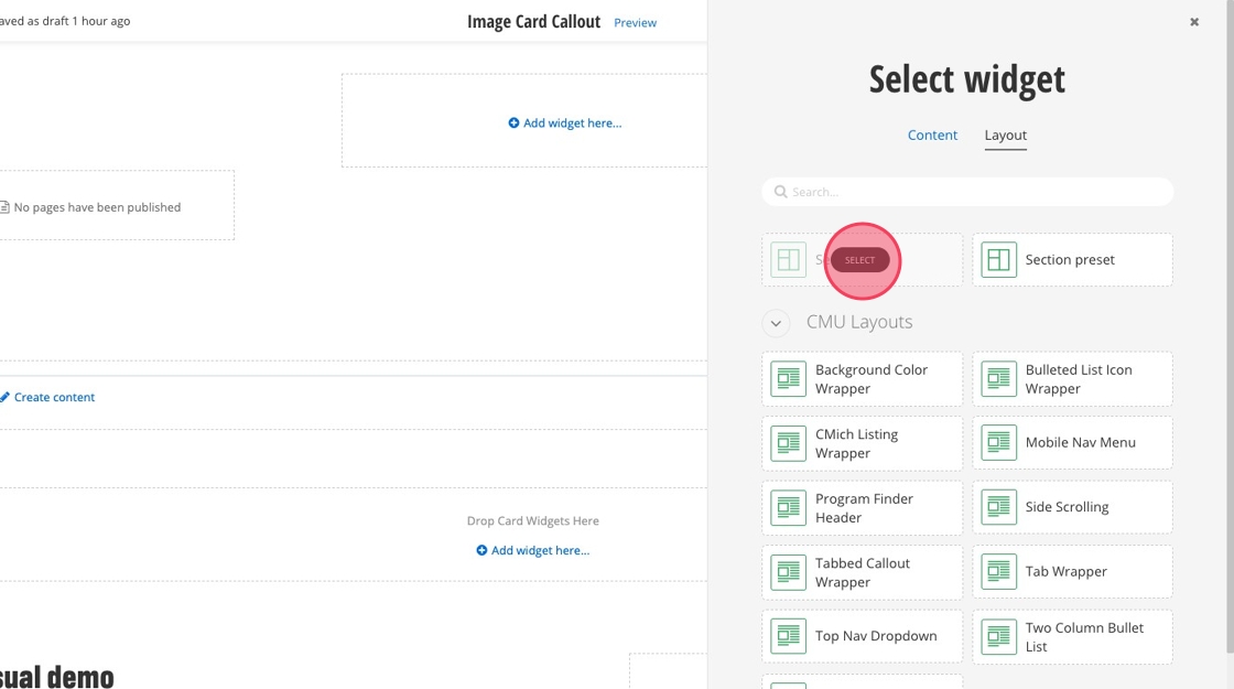
3. Select "Card Wrapper"
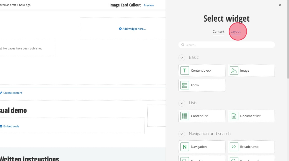
4. Inside the Card Wrapper, click "Add widget here..."
5. Click "Layout"
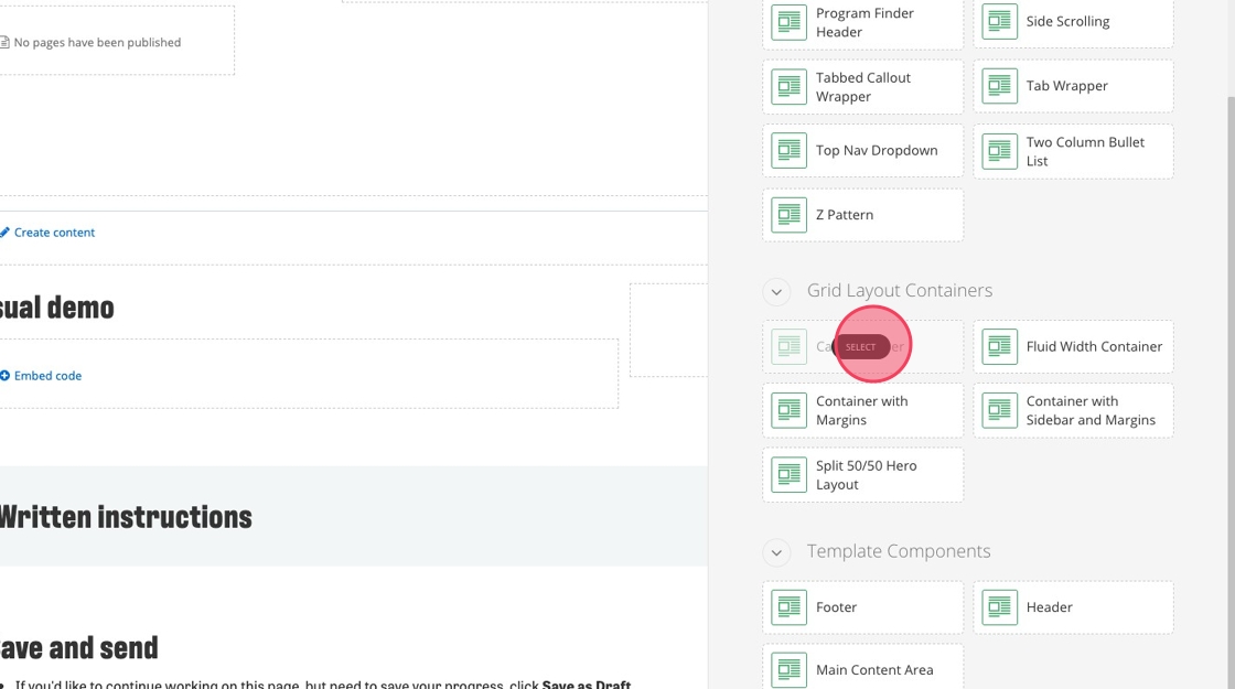
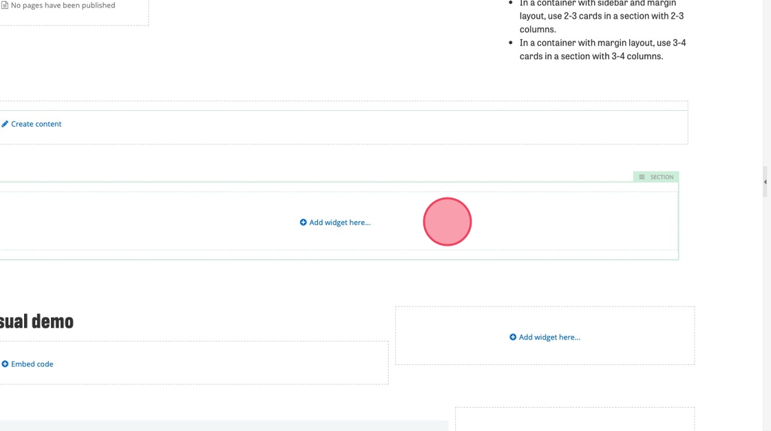
6. Select "Section"
7. Click "Add widget here..."
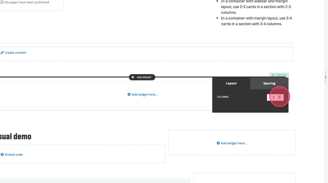
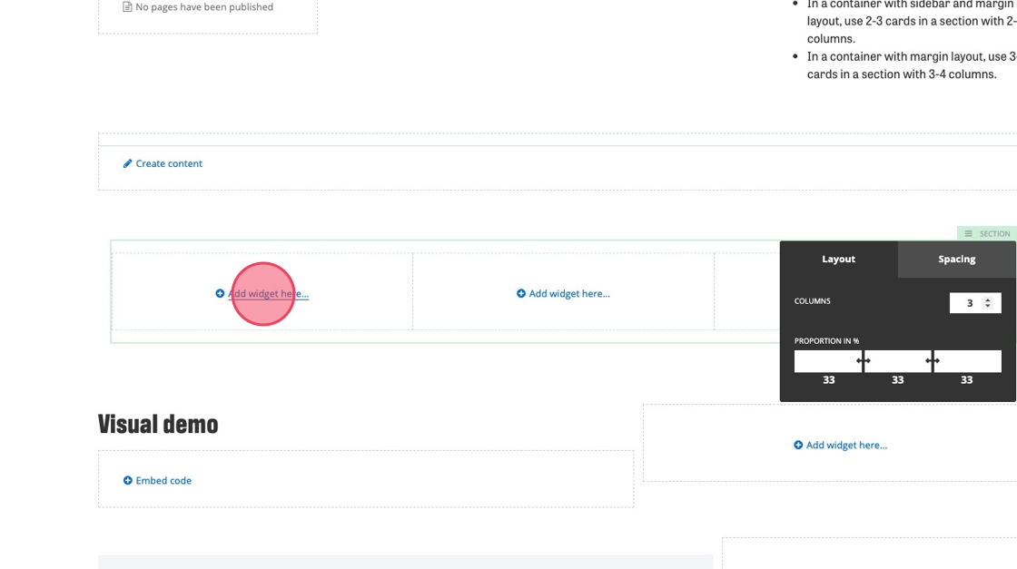
8. Click the margin and columns icon.
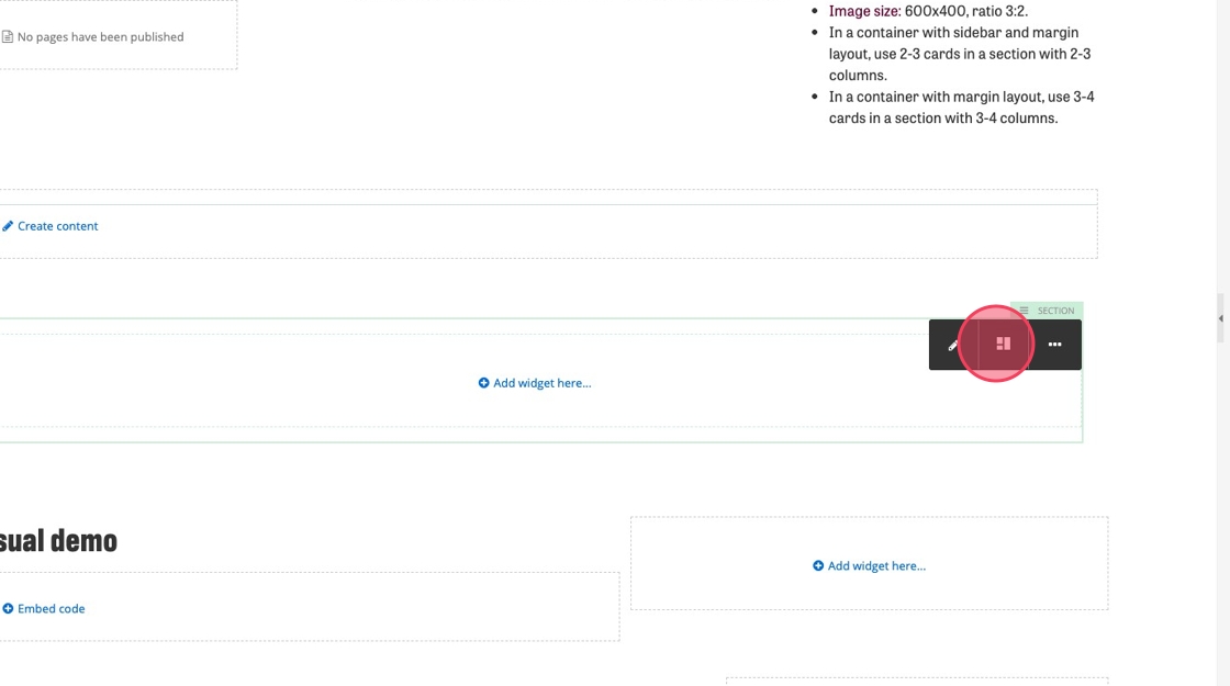
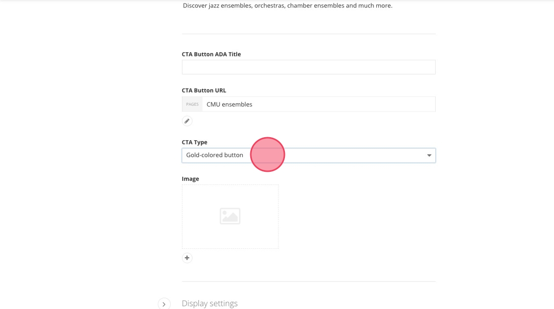
9. In the layout tab of the pop up menu, increase the Columns number to the number you want. This widget can hold 1 to 4 cards.
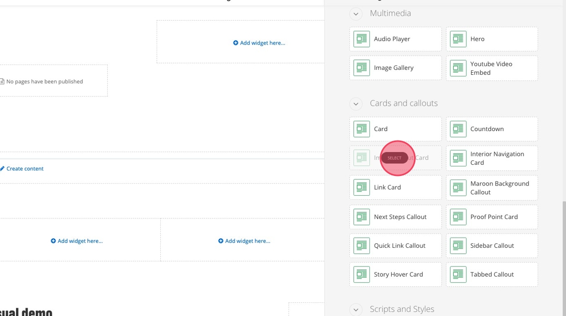
10. Click "Add widget here..."
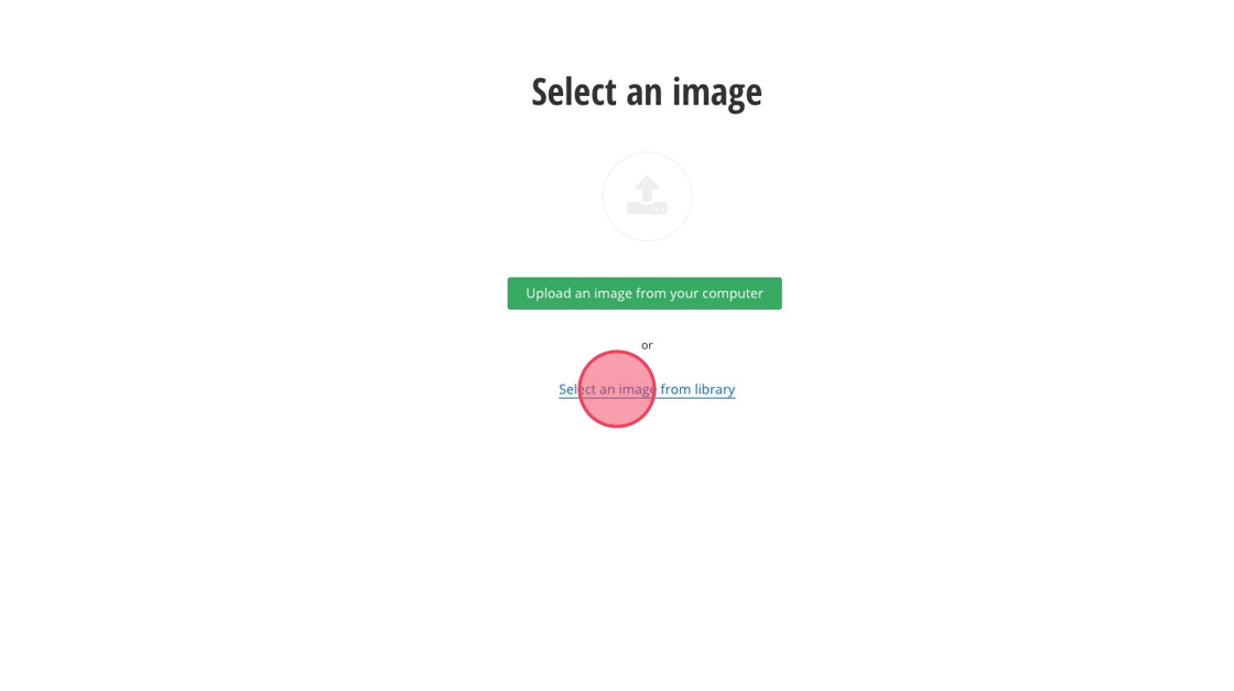
11. Select "Image Card Callout"
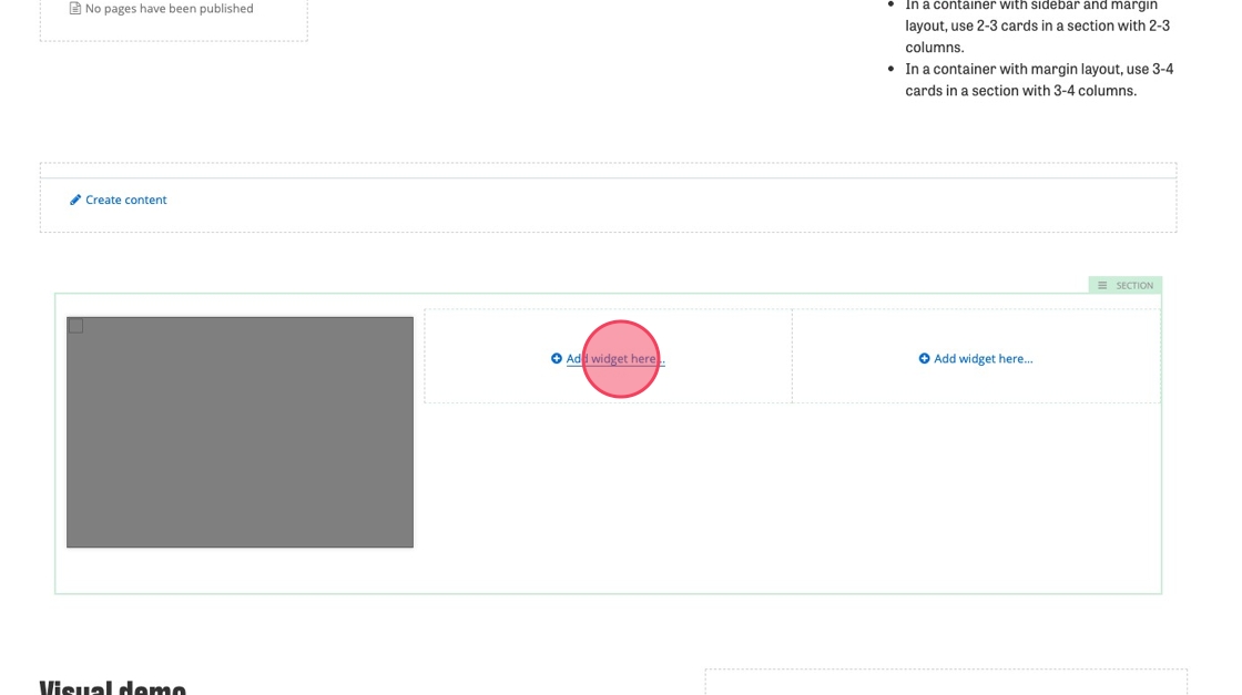
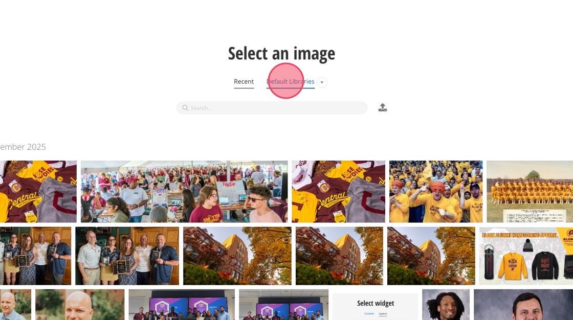
12. Click "Add widget here..." and select the "Image Card Callout" for the remaining columns.
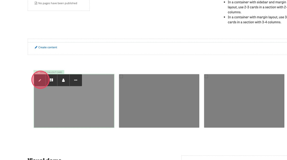
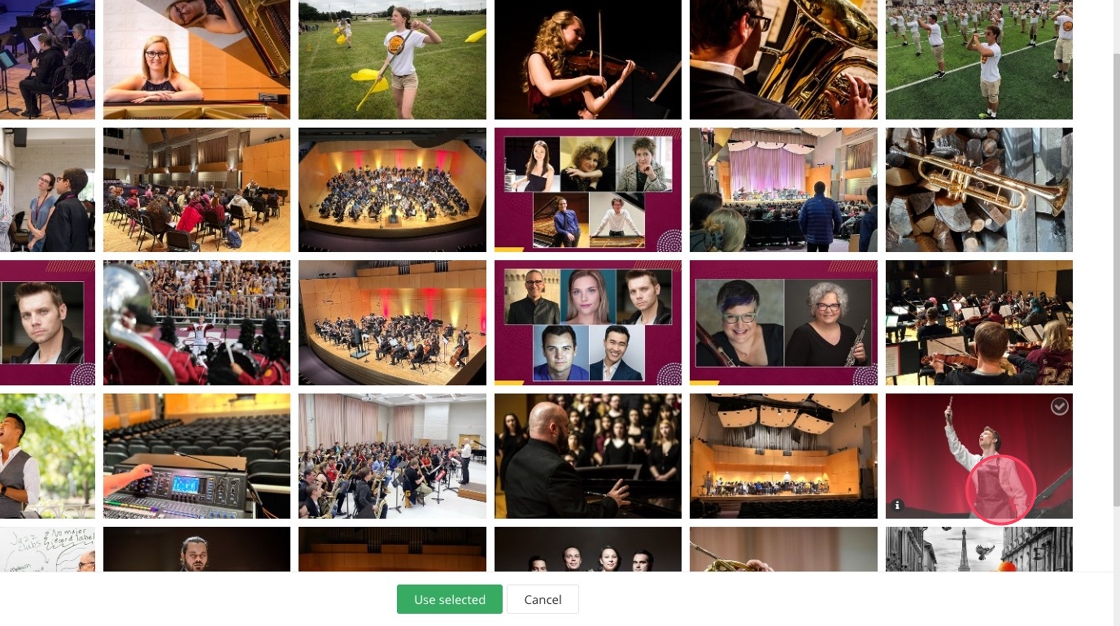
13. Click an image callout card
14. Click the edit icon in the pop up menu
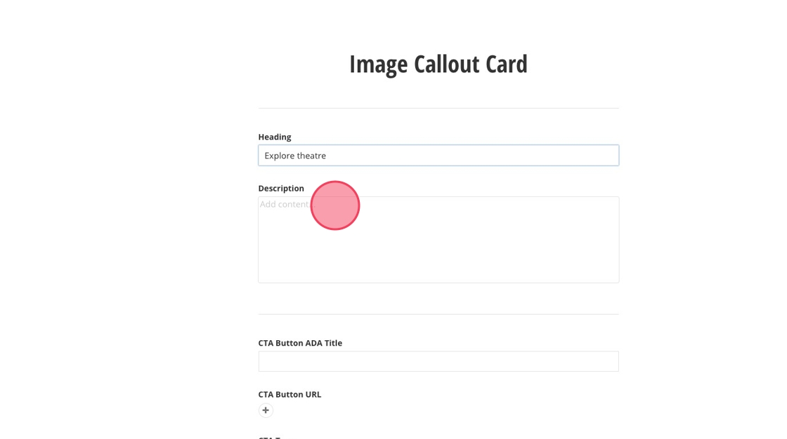
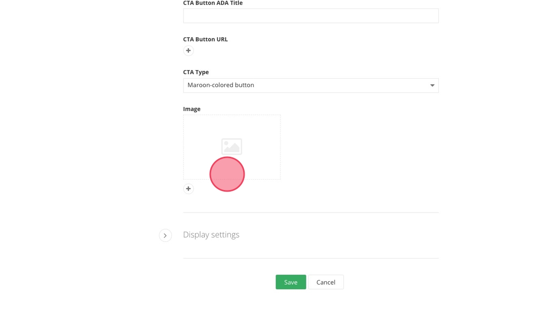
15. Add a heading. Maximum characters: 75
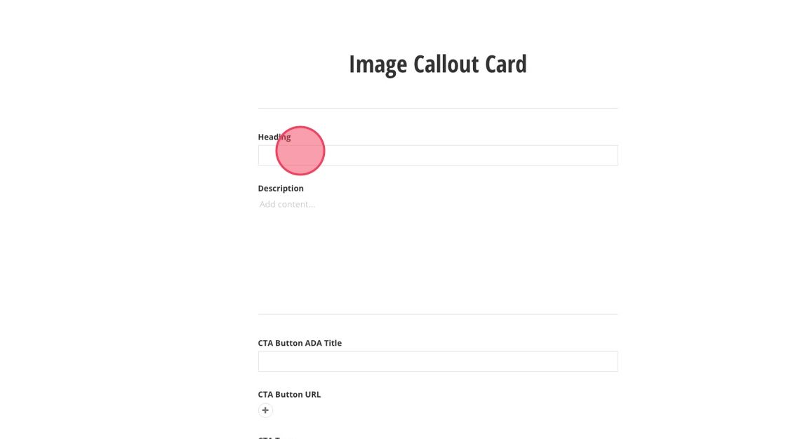
16. Add a brief description (optional). Maximum characters: 150
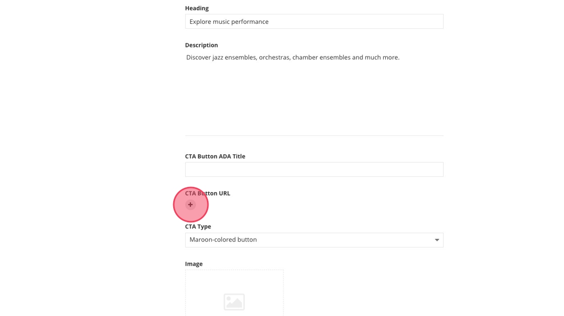
17. Click the + to add a URL for your image card callout link.
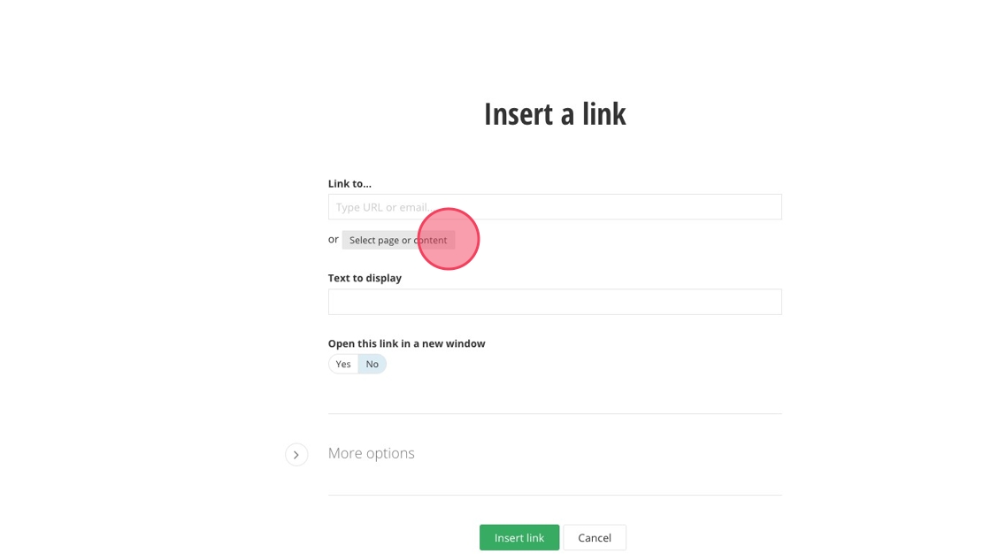
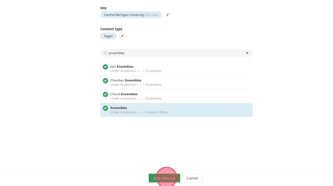
18. Click "Select page or content"
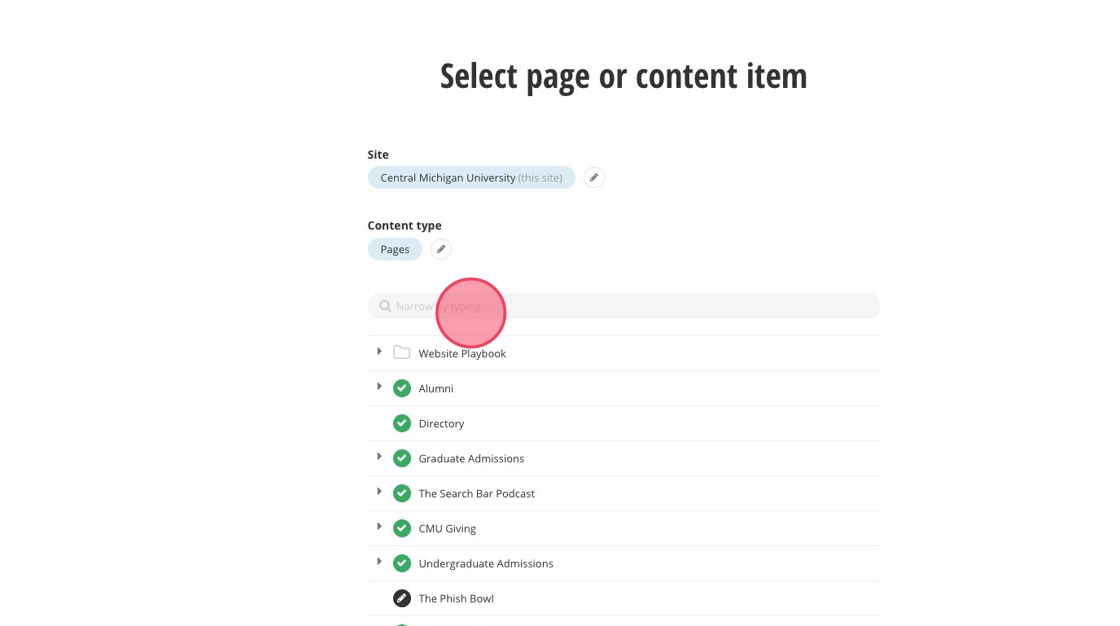
19. Locate the page you want to link to by navigating or searching the name
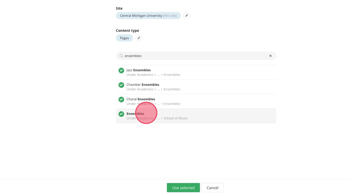
20. Select your page
21. Click "Use selected"
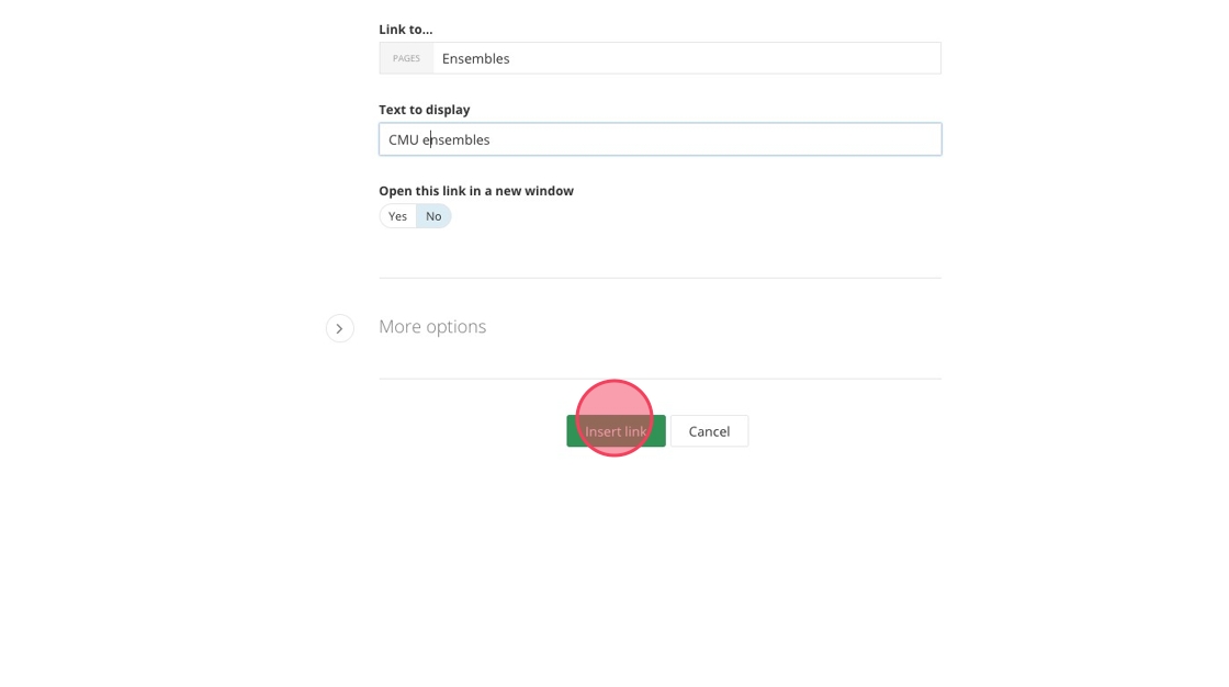
22. Click the "Text to display" field to edit your button text. Maximum characters: 30
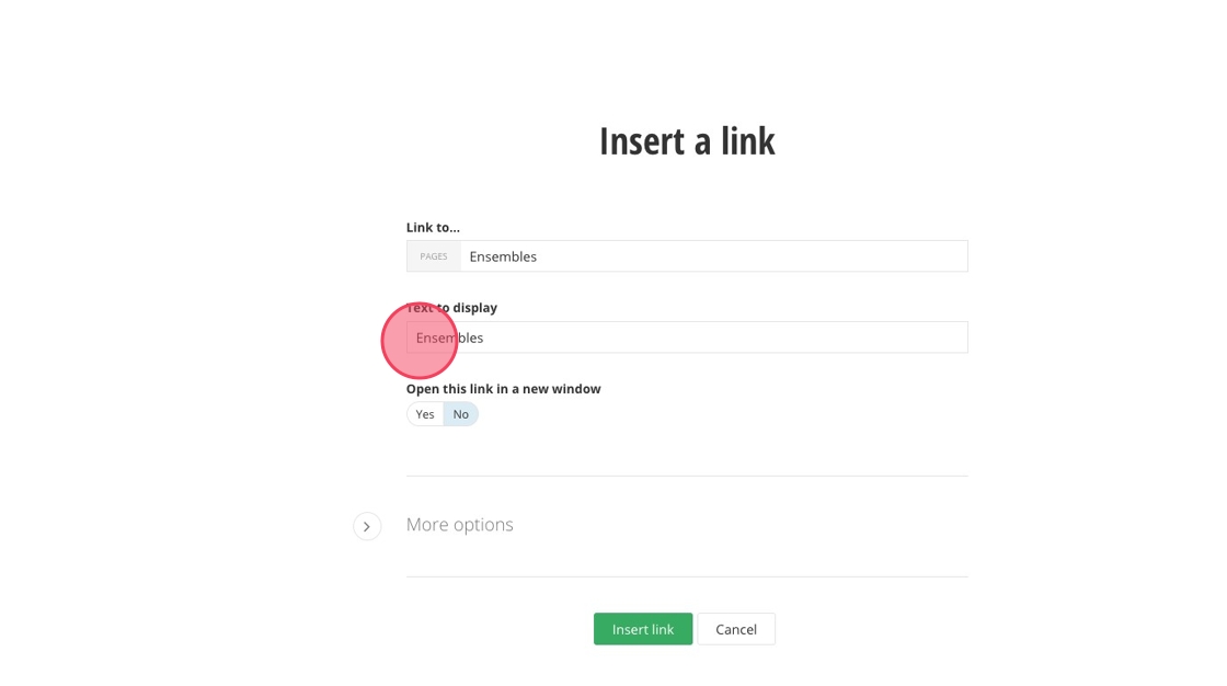
23. Click "Insert link"
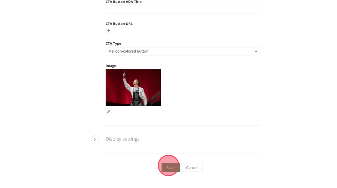
24. Add ADA text to your button
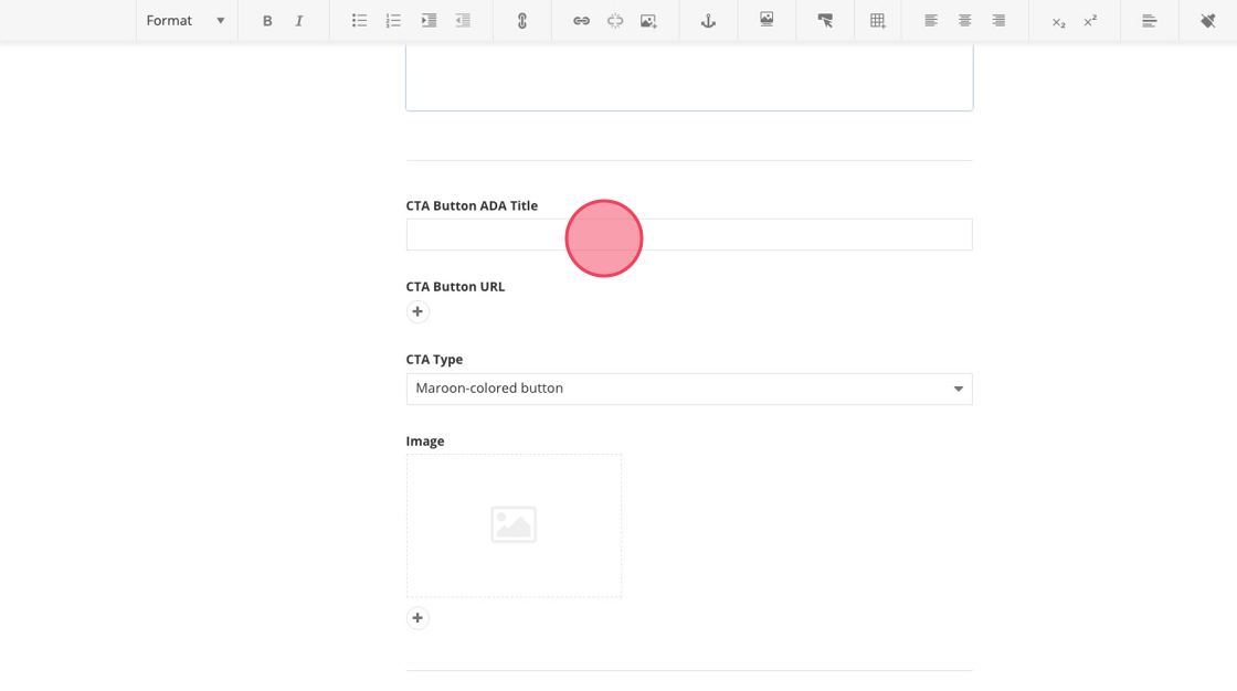
25. Select the "Gold-colored button" option.
26. Click here to start selecting an image.
27. Click "Select an image from library"
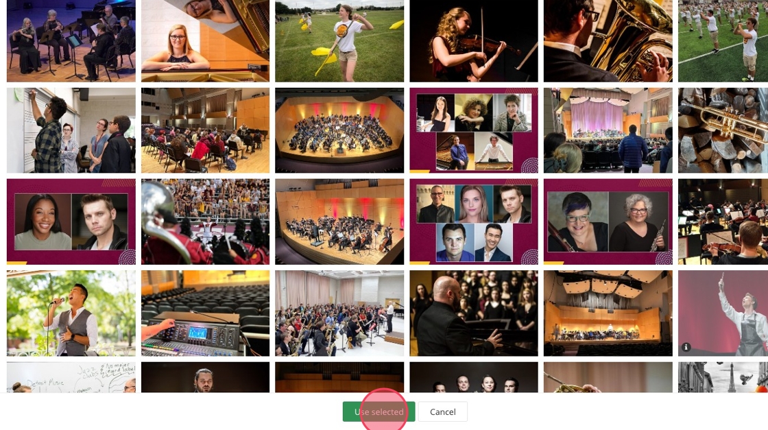
28. Click "Default Libraries" and search for your image name or navigate through the image folders to find your image.
29. Locate your image and select
30. Click "Use selected"
31. Click "Save"
32. Add the required image and the option heading, description or button elements to each card.
Save and send
- If you'd like to continue working on this page, but need to save your progress, click Save as Draft.
- If you're finished making changes to the page, and the page is ready for review, click Send for Approval.