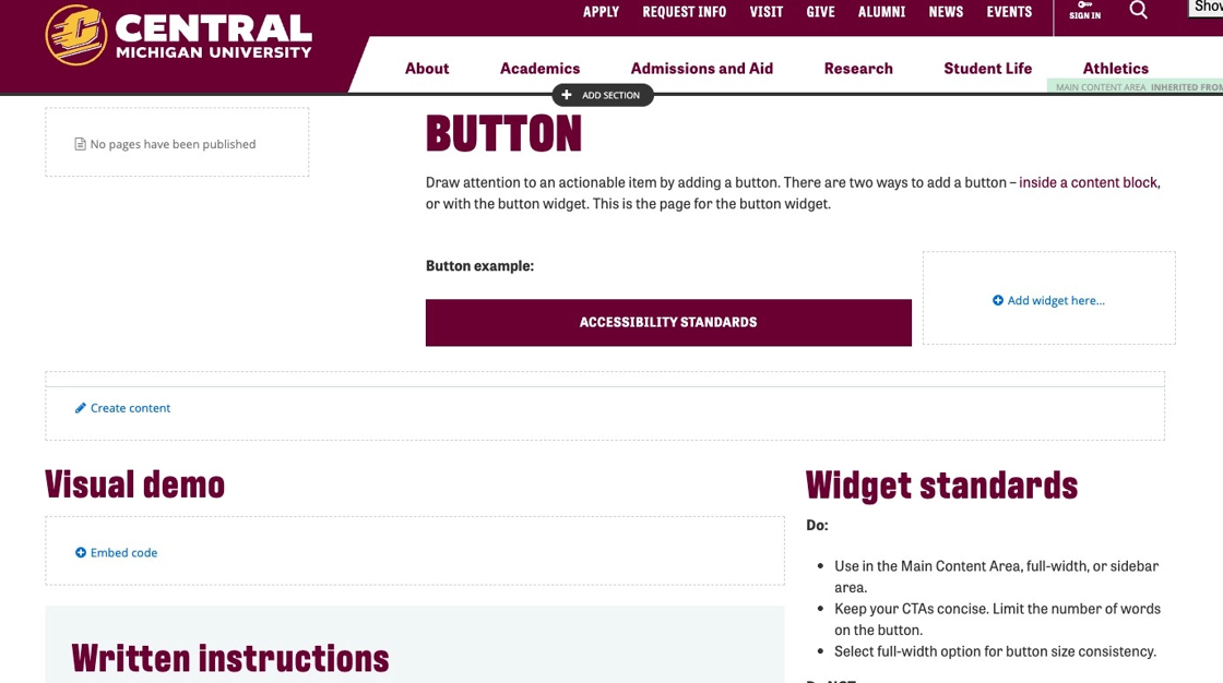
Button
Draw attention to an actionable item by adding a button. There are two ways to add a button – inside a content block, or with the button widget. This is the page for the button widget.
Button examples:
Visual demo
Widget standards
No layout is needed for this widget.
Do:
- Use in the Main Content Area, full-width, or sidebar area.
- Keep your CTA concise. Limit the number of words on the button.
- Select full-width option for button size consistency.
Do NOT:
- Stack more than two button widgets on top of each other.
- Use many words in your button text.
Written instructions
1. Click "+ Add widget."
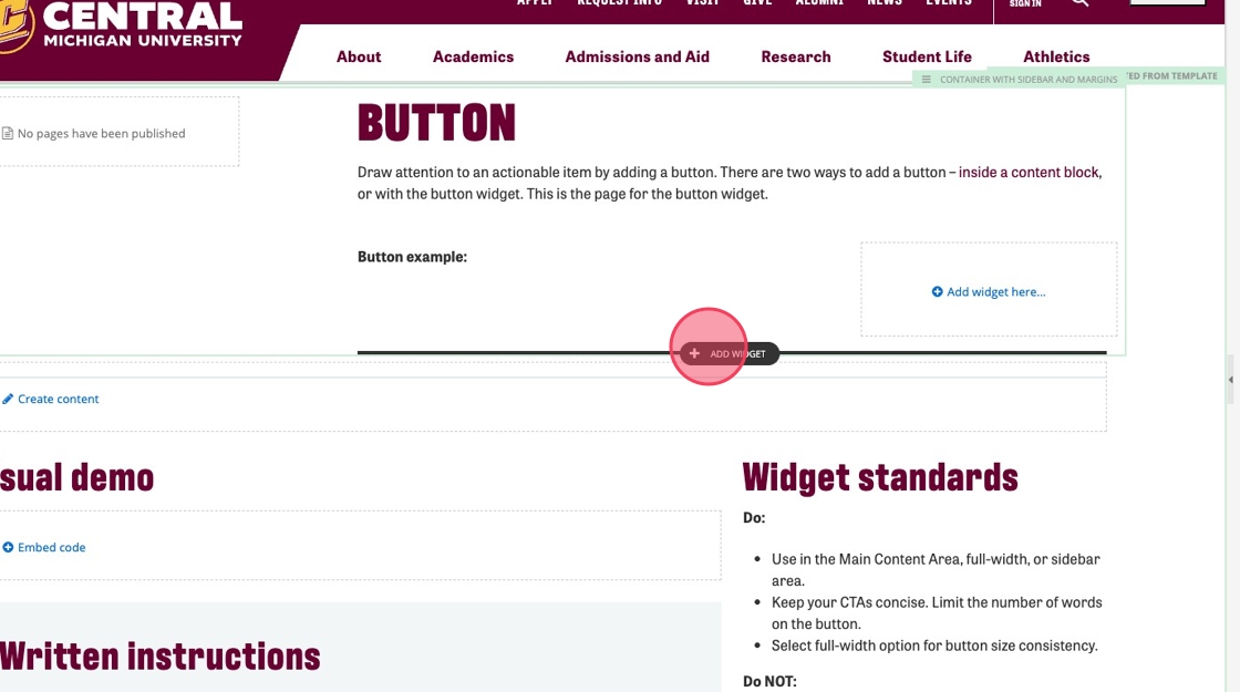
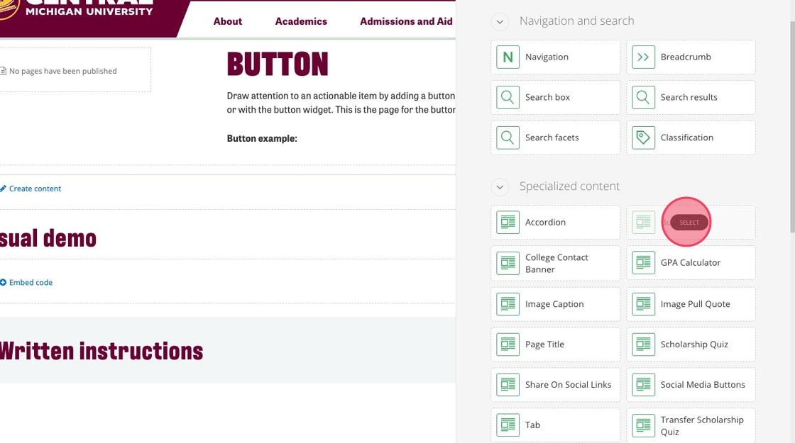
2. Select "Button."
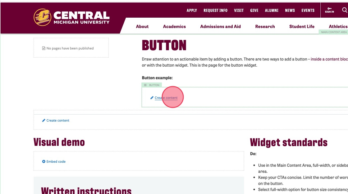
3. Click "Create content."
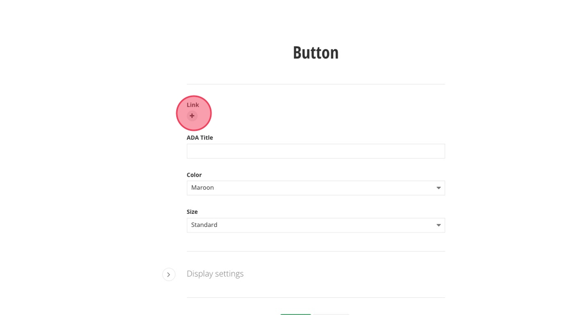
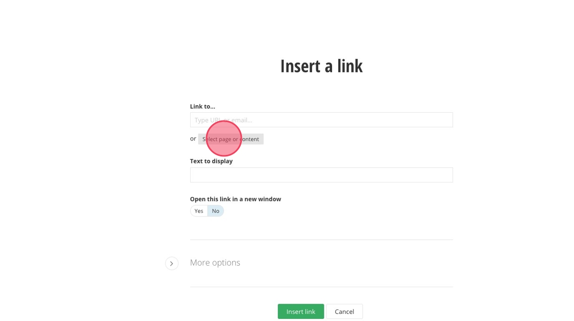
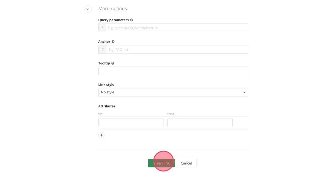
4. Click the + under Link.
5. Click "Select page or content."
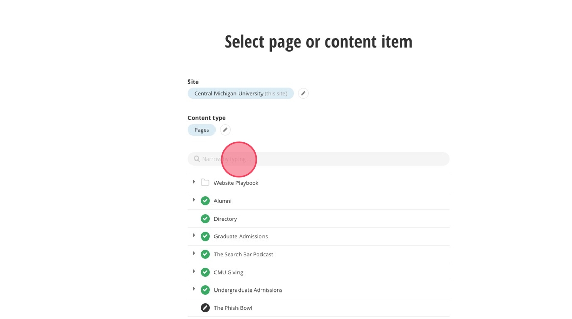
6. Locate the page you want to link to by scrolling or searching the name.
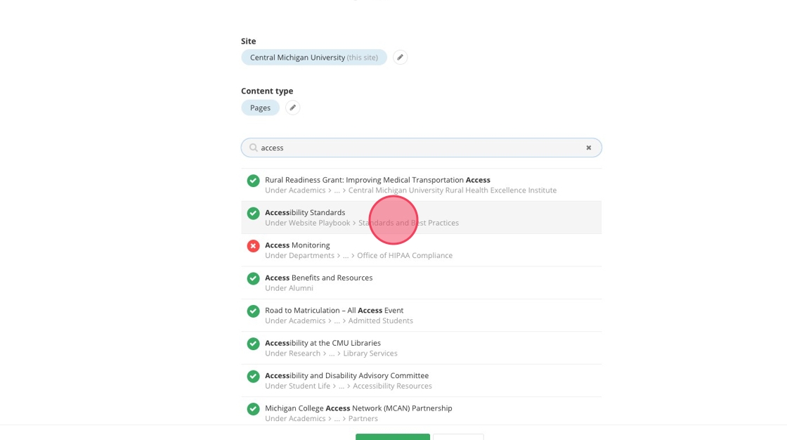
7. Select the page you want to link to.
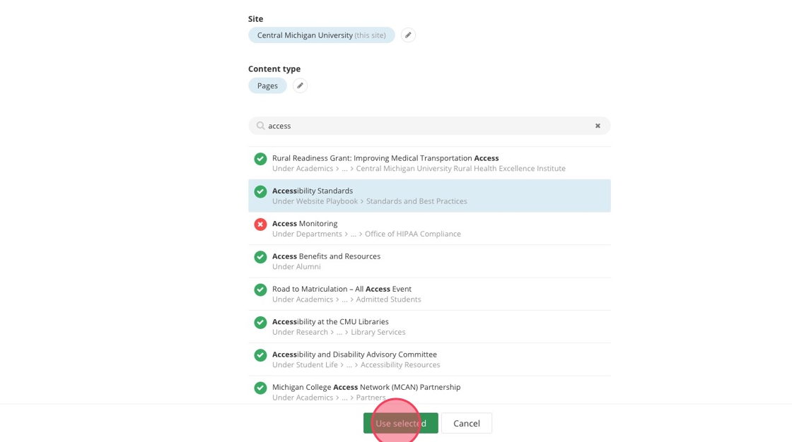
8. Click "Use selected."
9. Click "Insert link."
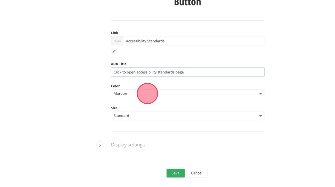
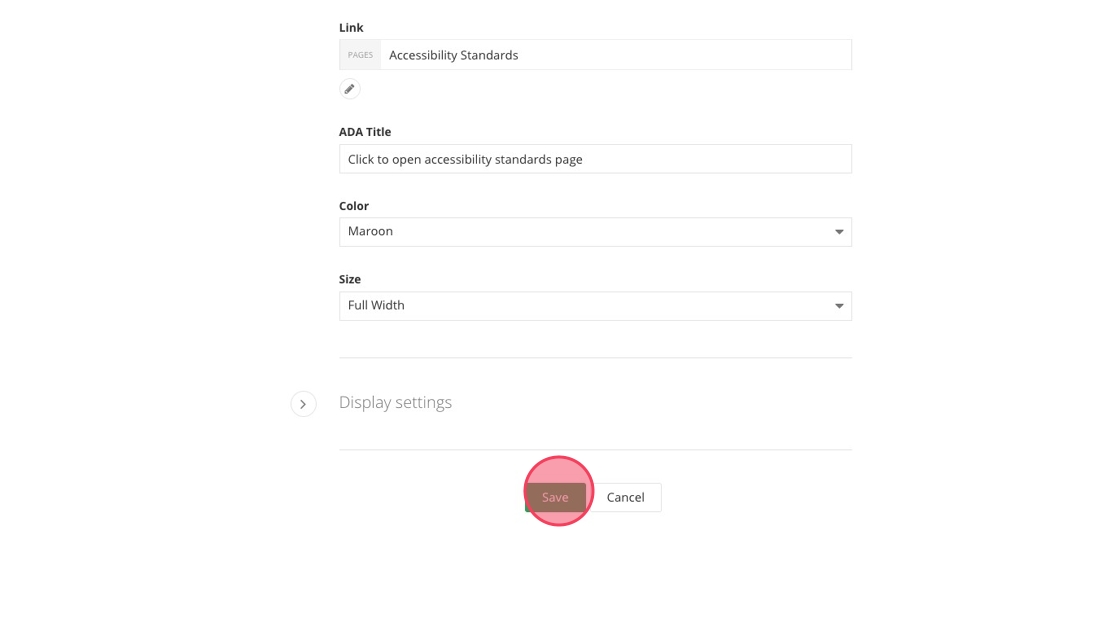
10. Add an ADA Title description for your button.
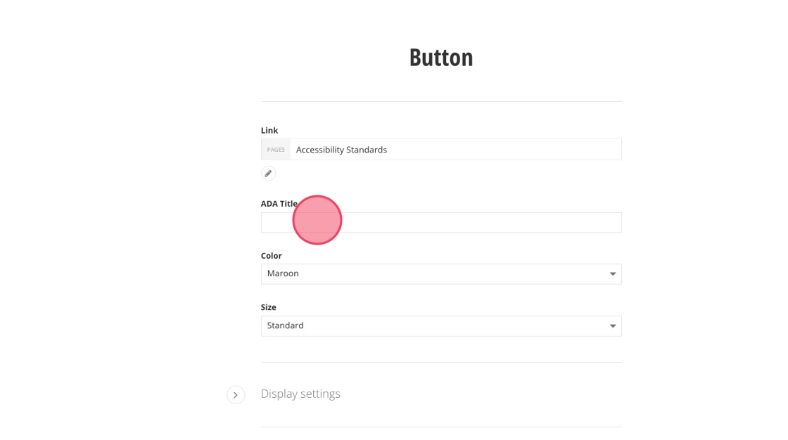
11. Select the color for your button: Primary CTA uses Gold, Secondary CTA uses Maroon or White.
12. Choose a width for your button: Small, Standard, or Full Width. If your button widget is in the sidebar, always select Full Width.
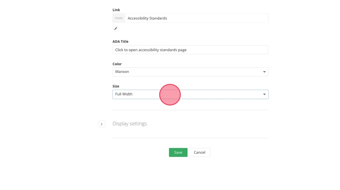
13. Click "Save."
14. Review your button widget.
Save and send
- If you'd like to continue working on this page, but need to save your progress, click Save as Draft.
- If you're finished making changes to the page, and the page is ready for review, click Send for Approval.