Content Block
The Content Block widget houses the text on your page. You can also add inline images, insert links, add buttons and emphasize different parts of the content using special features.
How to add a content block
Widget standards
Use in containers of any width.
Do:
- Use shared content blocks for repeatable information.
- To use in full-width, add the content block to "Container with margins," a preset Grid Layout Container.
- Copy and paste without formatting. Mac users: Shift + Command + V. Windows users: Control + Shift + V.
Do NOT:
- Copy and paste text from an MS Word document or web browser. This carries text styling that Sitefinity does not support and can affect the display of your content.
Shared content block
Shared content blocks ensure consistency of both formatting and information, shorten the creation process, and provide a much faster way to distribute and update information that is repeated in multiple locations.
The best part of shared content blocks? More accuracy, less maintenance for content like: contact information, numerical data and actions that you want in multiple locations (like scheduling an appointment, or applying to CMU).
There are several things you can do with content blocks:
Visual demo
Shared content block tips:
Check to see if a shared content block has already been created for the content you need. Common shared content block types include Contact, Tuition and Fees, and Schedule an Appointment buttons.
Visual demo
Visual demo
Content block toolbar
Inside of the content block, you'll find several choices for formatting text and adding interactive or engaging elements to your page.

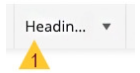
1. Text format: Select formatting from the dropdown list to automatically apply it to headers, quotes and paragraphs.
- H1 is for the Page Title widget only.
- Headers should follow the appropriate hierarchy, H2-H6 and should not be bold.
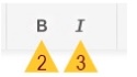
2. Bold: Makes the text bold.
3. Italic: Makes the text italic.
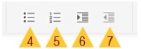
4. Bulleted list: Add a bulleted list format to your text.
5. Numbered list: Add a numbered list format to your text.
6. Right indent: Move the text farther to the right on the page.
7. Left indent: Move the text father to the left on the page.
8. Insert speed bump: A speed bump is a pre-filled pop-up that alerts users they are in transition to an external website. Speed bumps are useful for alerting the user that the website they are going to may have different privacy policies.

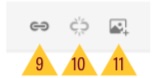
9. Create a link: To link to other internal pages, choose the page from the page tree. Do not copy and paste the page link address. You can also use this button to link to documents within the DAM. To link to an email, enter the email address. The system will automatically add the "mailto:."
10. Remove a link: If text is hyperlinked, this action will break the link and remove it.
11. Add an image: Select an image from the DAM to add to a content block. Do not copy and paste images into content blocks.
12. Insert anchor link: Allow readers to jump to the area of content they are most interested in. Learn more about anchor links below.

13. Insert image with caption:

14. Insert button: Insert a call to action (CTA) button in your content. You must enter the URL field. If the URL link field is left blank, the content block widget will not function properly. Learn more about adding buttons here.

15. Create table: Add a table to your content to help organize information.

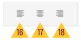
16. Left align: Align your text to the left side of the page.
17. Center align: Do not align your text to the center of the page.
18. Right align: Align your text to the right side of the page.
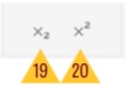
19. Subscript: Add a subscript to your text (characters that are set sightly below the normal line of type.)
20. Superscript: Add a superscript to your text (characters that are set slightly above the normal line of type.)
21. Interior horizontal rule: The horizontal rule provides a horizontal line on the page to add a visual queue of separation between content.

22. Clean formatting: The clean formatting tool removes all formatting guis from text when it's passed into the content block. While this feature is available and important, we've found that cleaning the formatting out using notepad or textedit is the most efficient method.

23. View code: Manipulate a page by changing the html code. This action is reserved for developers and digital strategists. Please do not use.

Add an image
Add images to the Content Block widget to grab users' attention and tell a more interesting story. You can include a picture of the dean with their message; show students conducting research in a lab; or illustrate your area's unique opportunities with examples from classes, field work, special presentations and more.
Add an image inside a content block if you want other content, like text, to wrap around the image. This is great for blogs and news stories!
Visual demo
Image tips:
You must size your image, optimize the file and upload your image to the DAM and fill out image properties before adding it to a content block.
Follow these instructions to upload images to the DAM.
Add a speed bump
Use speed bumps to link out to webpages outside of cmich.edu. This alerts the user that a new tab or window will open when the link is clicked.
Visual demo
Speed bump tips:
- Fill out the ADA field by describing the resource you are linking to.
- Example: External links: In or Out has the ADA text, "Article by DigitalA11Y, a web resource for online accessibility."
Add links
Add links to the Content Block widget to help guide your audience to more information or prompt action.
Visual demo
Link tips:
- Place the link on text that describes what the user can expect to find after clicking the link.
- Example: Which text tells you more about this link: click here or Visit University Communications?
- Open non-cmich.edu pages and linked documents, like PDFs, workbooks and external forms in a new tab.
Add anchor links
Anchor links are web links that help your audience quickly jump to a specific section of a webpage, and saves the need to scroll through a page heavy with text.
Here's an example: this anchor link will take you to the Content block tips section.
Visual demo
Anchor link tips:
- Add anchor links to headers only, H2 through H6. Anchor links do not work on bolded text.
- Only add anchor links to text in a content block. It is not designed to function in other widgets.
- Consider using anchor links to create mini-navigation areas with bullet points, as seen at the top of this page.
Add a button in a content block
Use buttons to help users navigate to other online resources.
Content block button example:
Visual demo
Button tips:
- Select the gold button style for primary CTAs, or the main goal of your page. Using more than one gold button creates confusion for users.
- Select the maroon button style for secondary CTAs, or actions that the user can still take but are not the main purpose of the page. If you have other buttons that are under the maroon button priority, use the white button style.
Create a table
Use tables to organize information in a way that is easy for all users on any device.
| this | table | example | shows | side | to | side | scrolling |
|---|---|---|---|---|---|---|---|
| a | b | c | d | e | f | g | h |
| 1 | 2 | 3 | 4 | 5 | 6 | 7 | 8 |
- Be sure to use the maroon and gold labeled bar! This helps make the content accessible for all users, including those with visual impairments and those using assistive devices.
Visual demo
Table tips:
- Limit the number of columns to fit the width comfortably.
- Ensure text is concise and clear.
- Before building your table, check if there is another widget that is better suited for your content. Example: Use the Content list events widget instead of outlining your events in a table.
Be sure to use the maroon and gold labeled bar! This helps make the content accessible for all users, including those with visual impairments and those using assistive devices.