Now through October 31, we're waiving application fees for all freshman and transfer applicants!
*Common app code: Central27
Story Hover Card
For use in main area of containers.
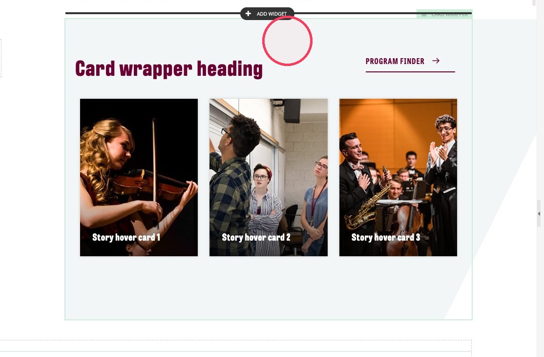
The Story Hover Card widget is used to highlight three items in a side-by-side fashion by pairing an exciting image with a brief description. It includes text with a rollover feature that shows additional text and a Call to Action link when your mouse hovers over it.
Example of Story Hover Card:

Visual demo
Widget standards
- The Card Wrapper layout is needed for this widget.
- This widget must be in a section
Do:
- Image size: same as mobile of Maroon Background Callout, 420 x 560, Ratio 3:4.
- The focal point of the image should be towards the top.
- Use 3 or 4 cards per set.
Do NOT:
- Use fewer than 3 cards.
- Use more than 4 cards.
- Use more than one Story Hover Card set per page.
Written instructions
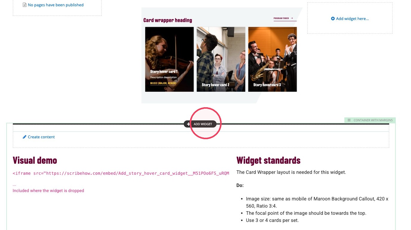
2. In the section, click + Add widget.
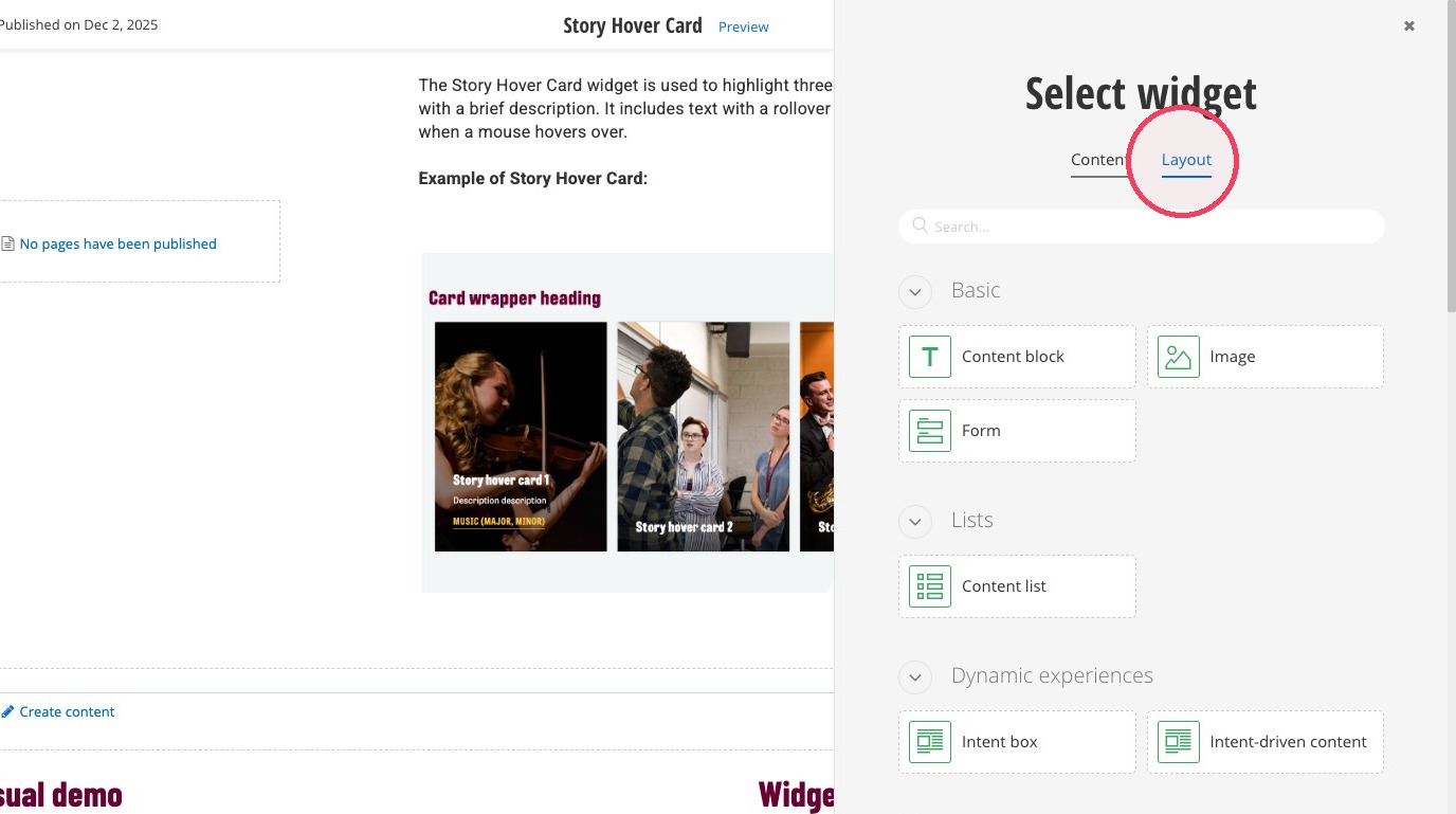
3. Click the Layout tab.
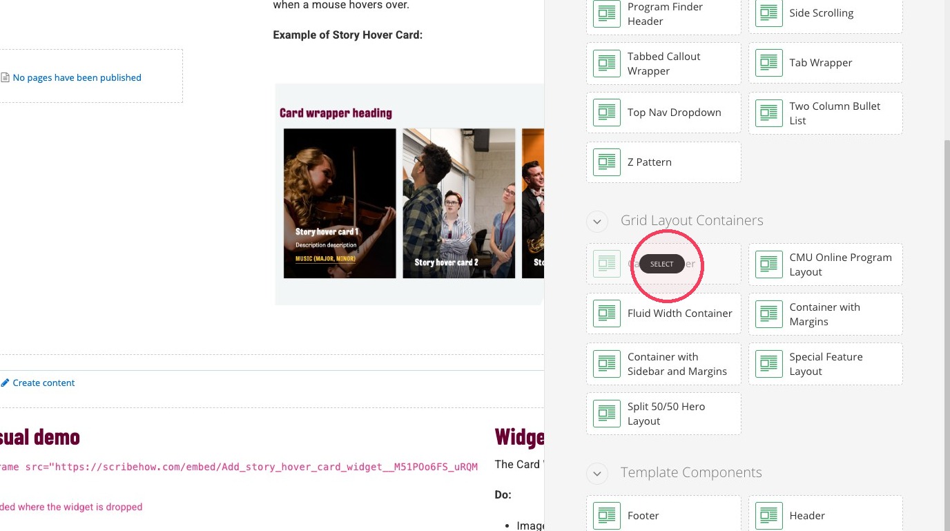
4. Select the Card Wrapper layout.
5. Click on the main area of the card wrapper layout box.
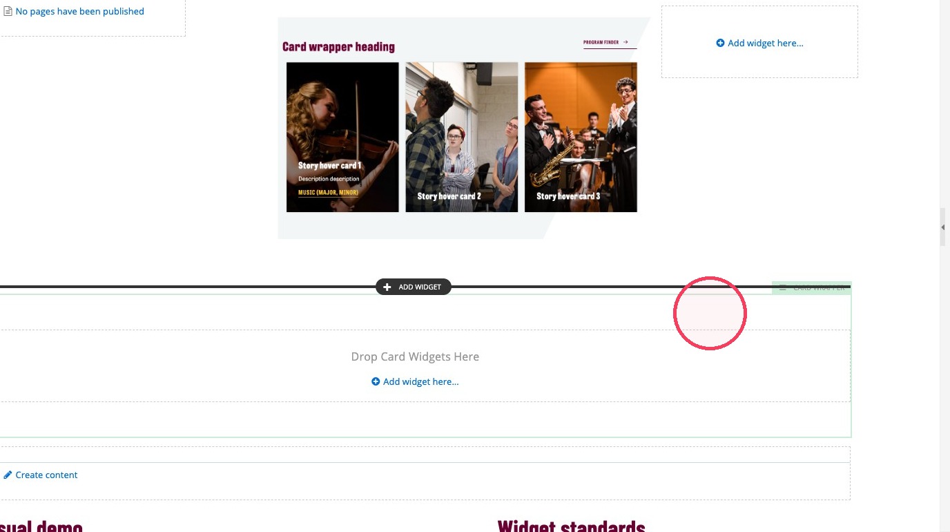
6. Click the editor icon on the pop up menu.
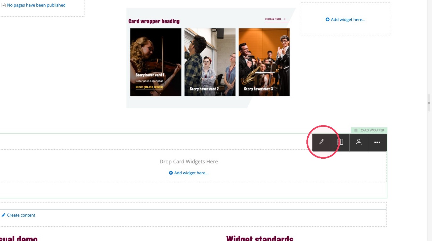
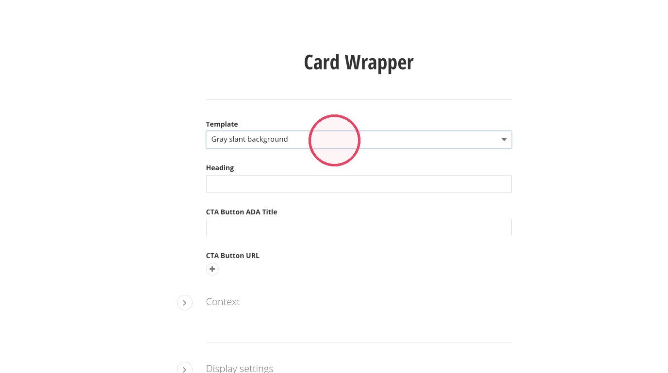
7. Select the "Gray slant background" template option.
8. Add a Heading to your card wrapper.
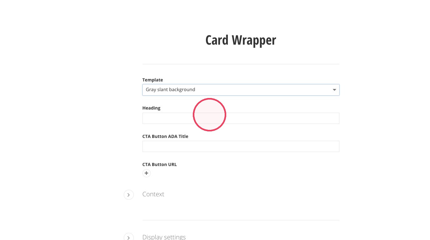
9. Optional: Add a link to the card wrapper. Click + then "Select page or content," and select your link of choice. Then, click "Use selected," "Insert link," and add an ADA Title for your link.
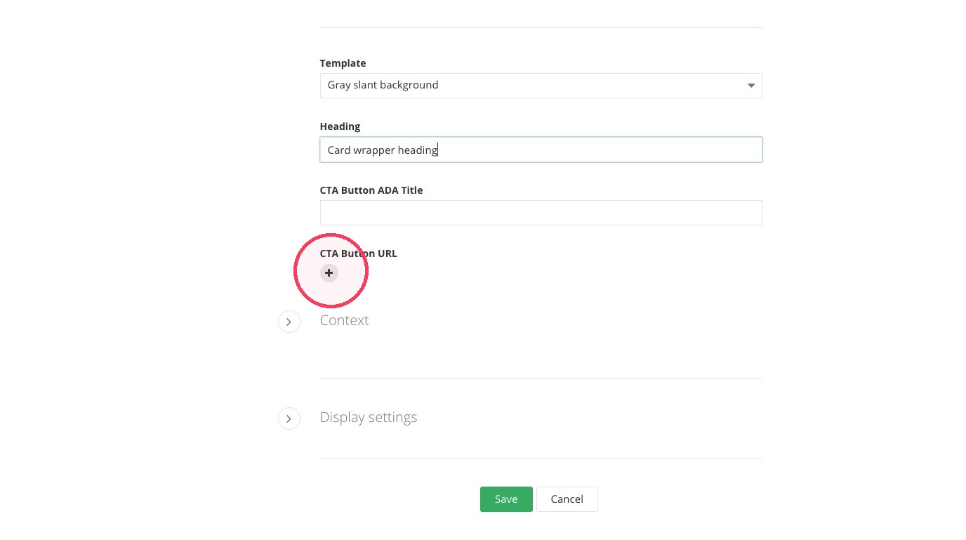
10. Click "Save"
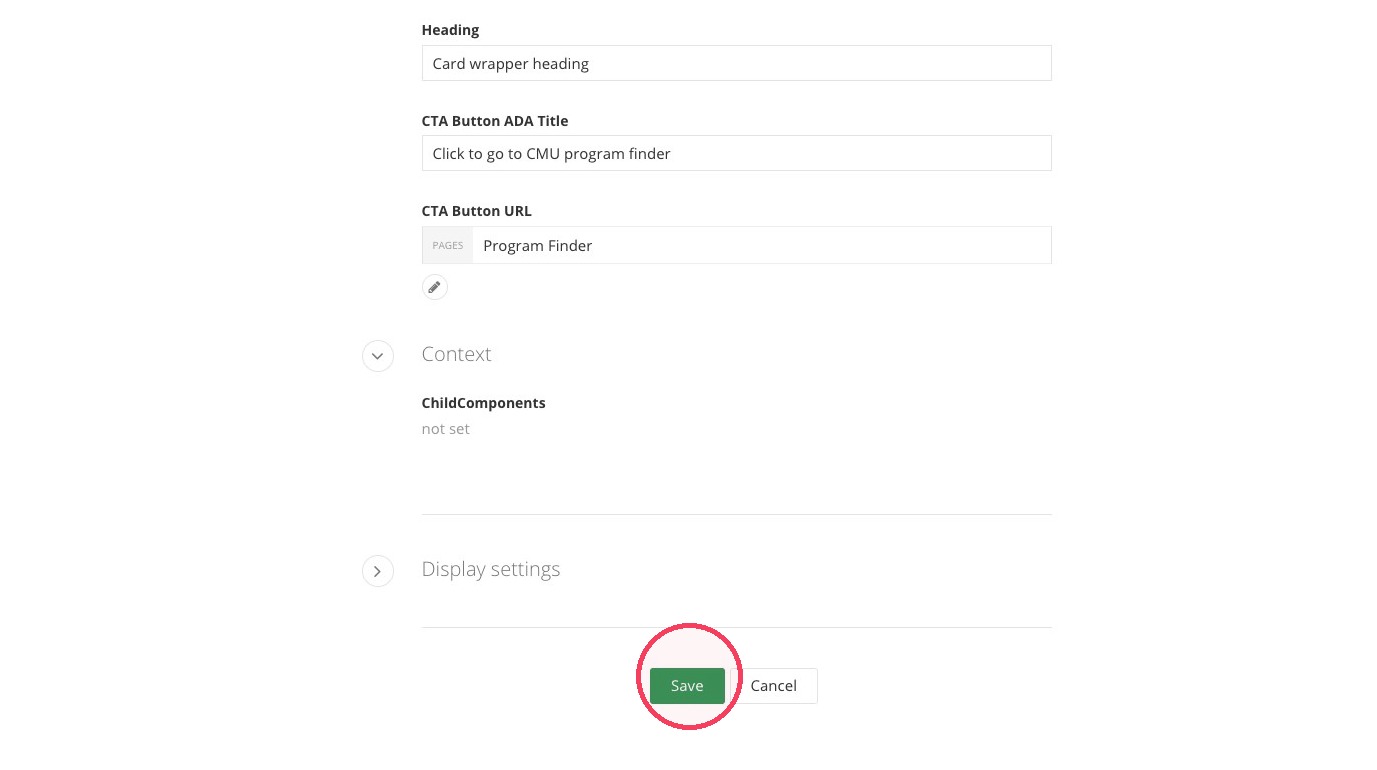
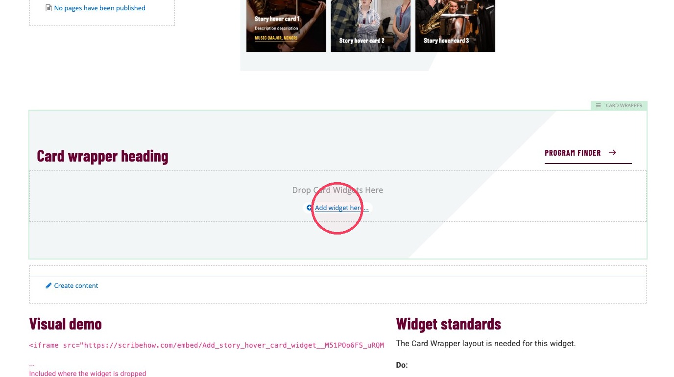
11. Click + Add widget here...
12. Click Layout.
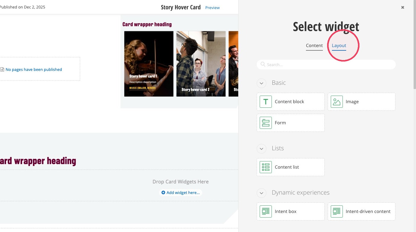
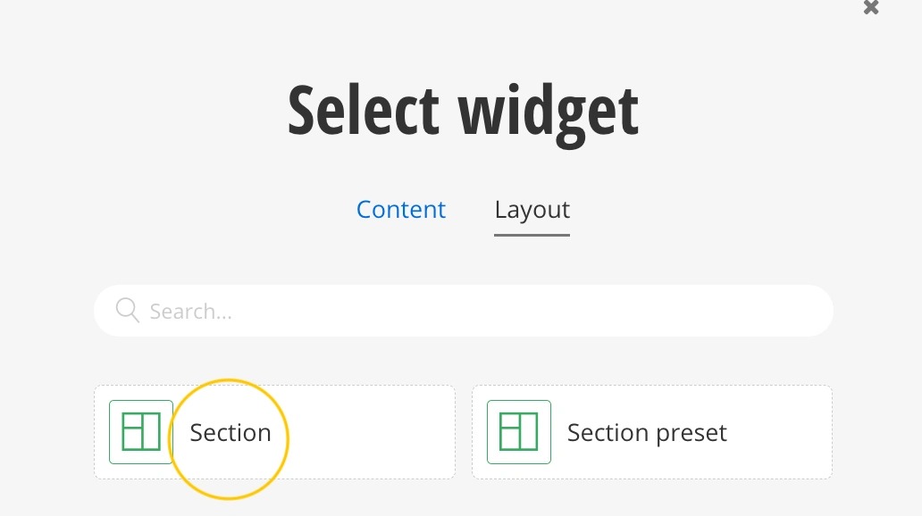
13. Select a Section.
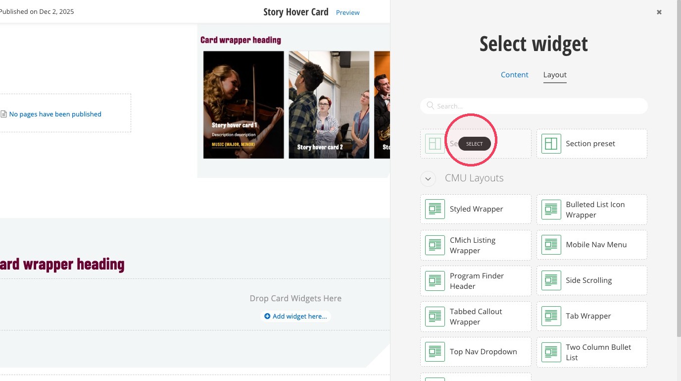
14. Click on the section to open the black pop up menu.
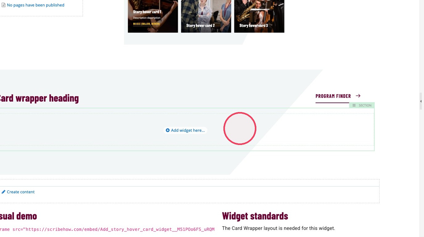
15. Click on the margins and column icon.
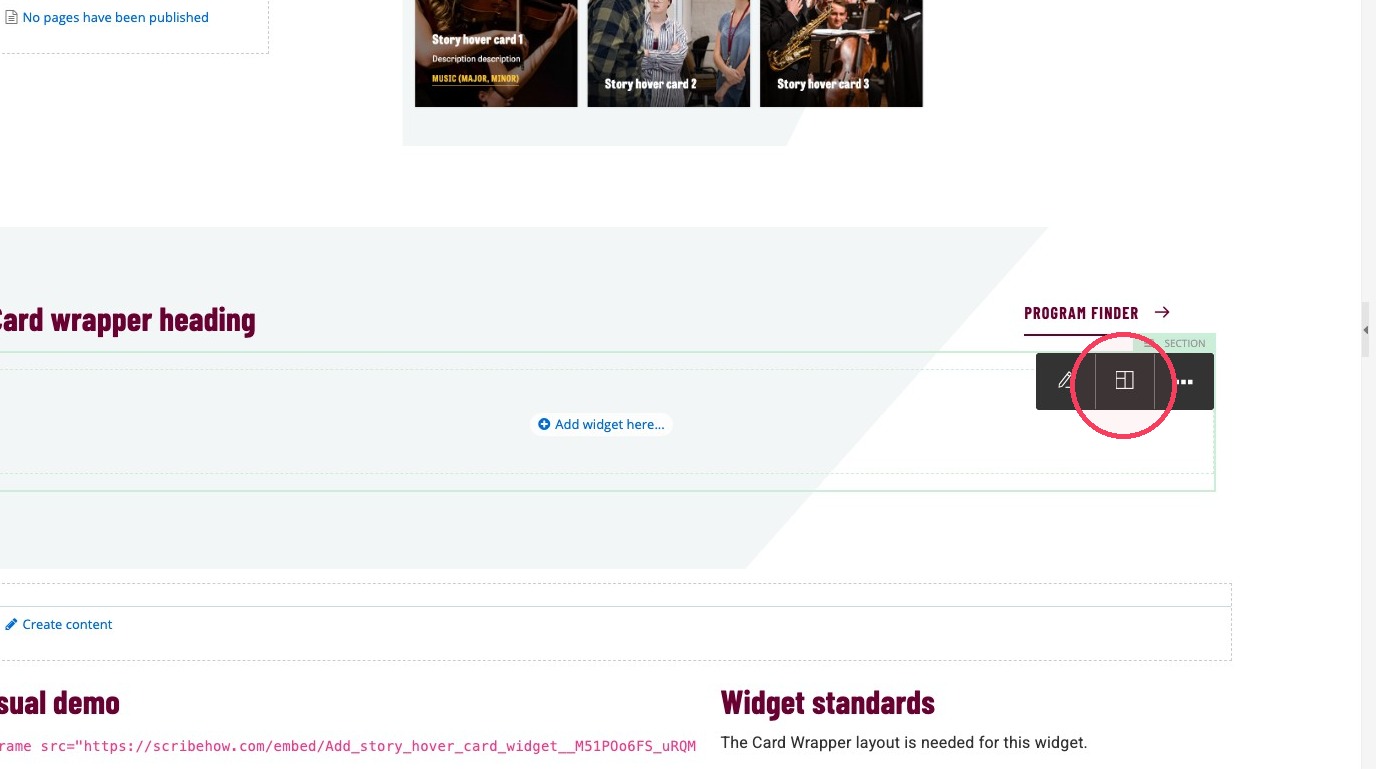
16. Increase the number of columns to 3.
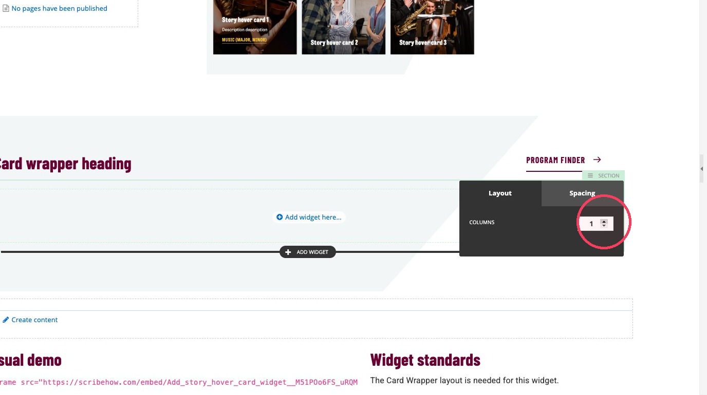
17. Click + Add widget here...
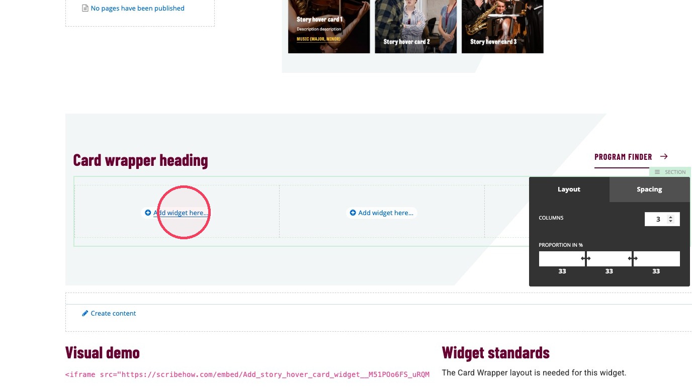
18. Select the Story Hover Card widget.
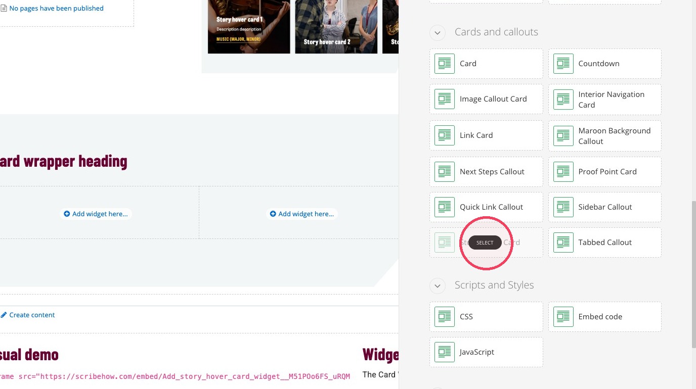
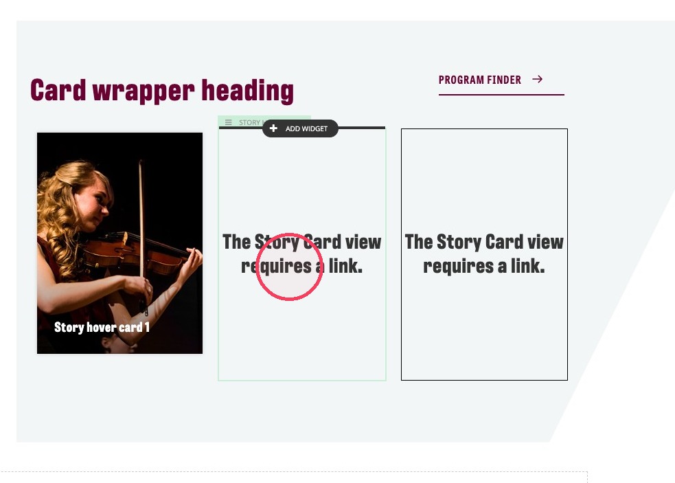
19. Add one Story Hover Card to each column.
20. Click on The Story Card view requires a link.
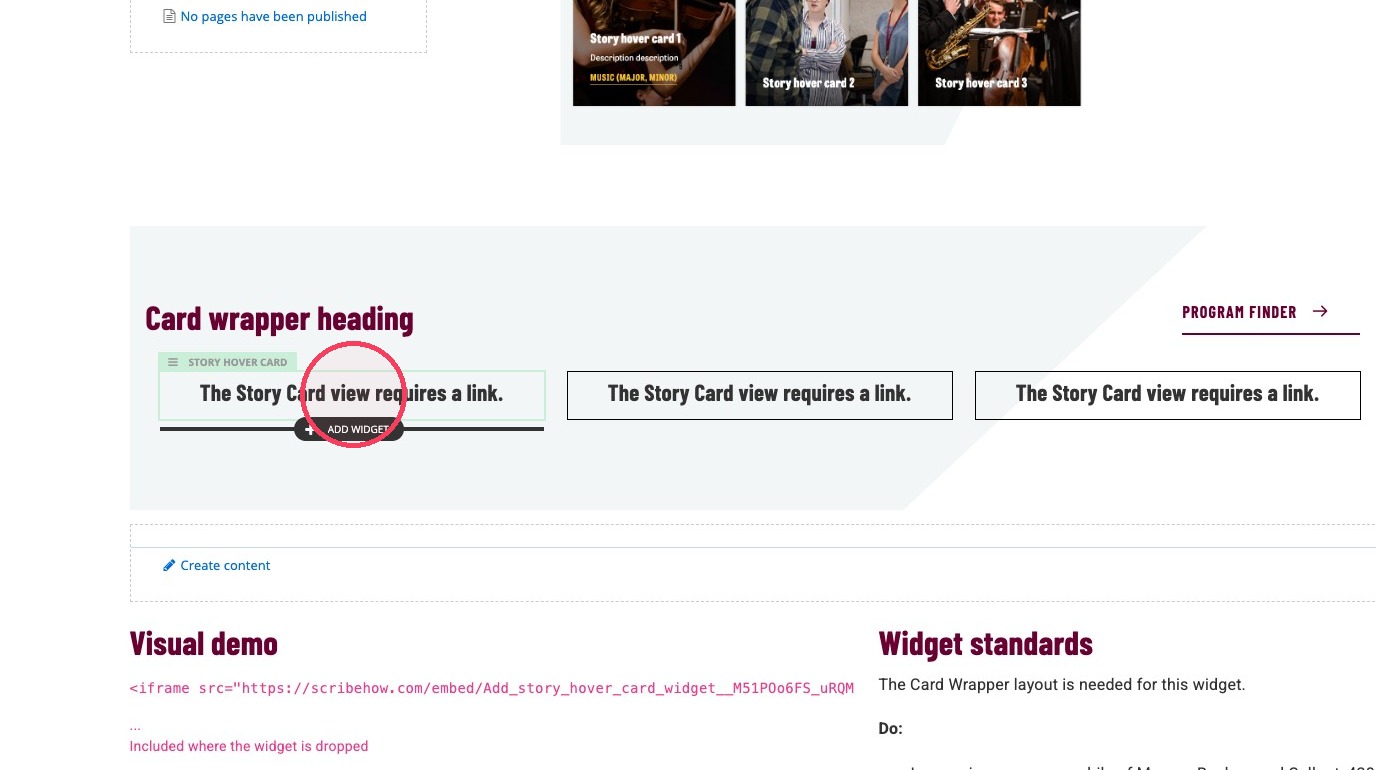
21. Click the edit icon on the black pop up menu.
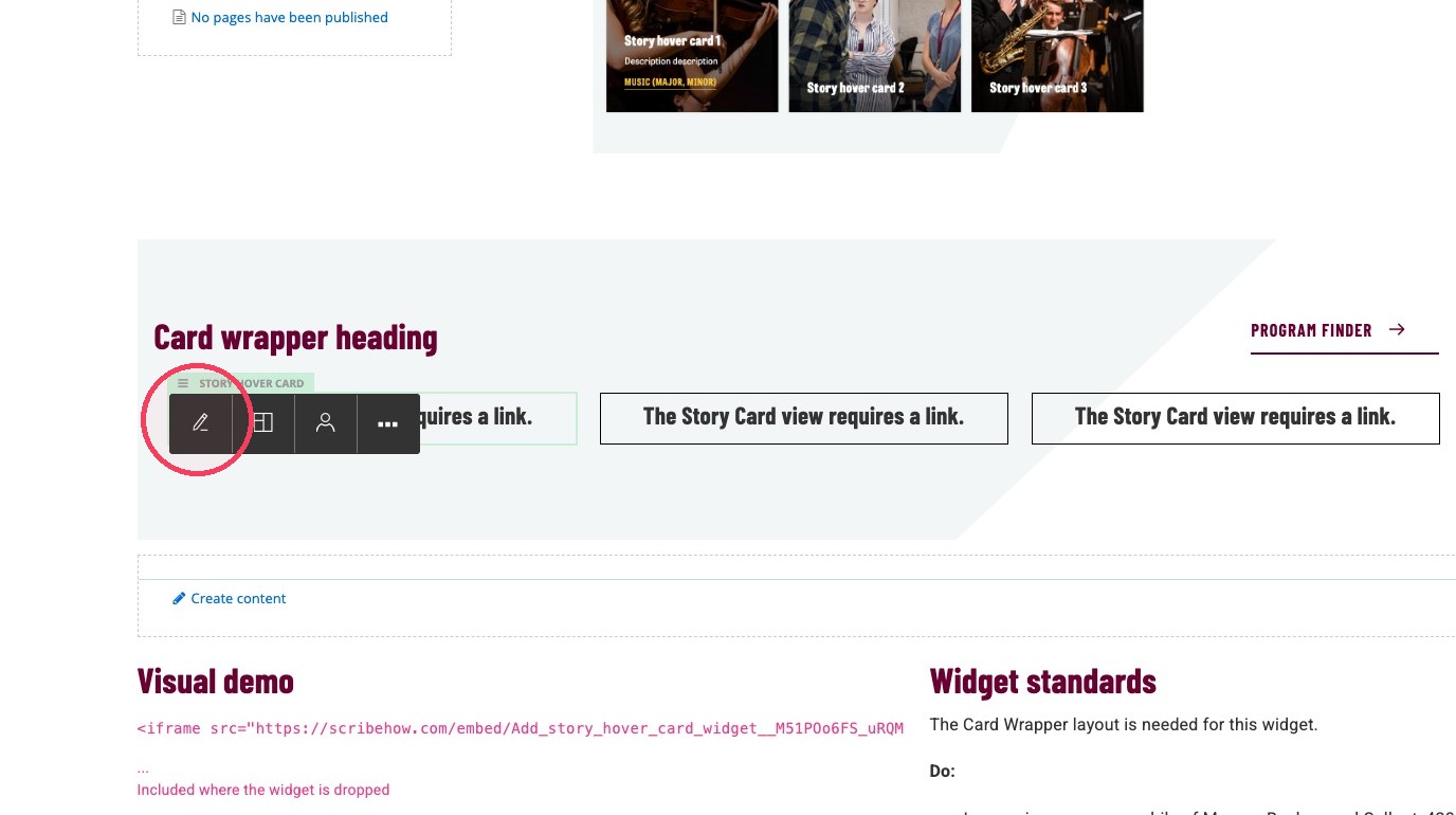
22. Add a heading under Heading to your first story hover card. Maximum characters: 50
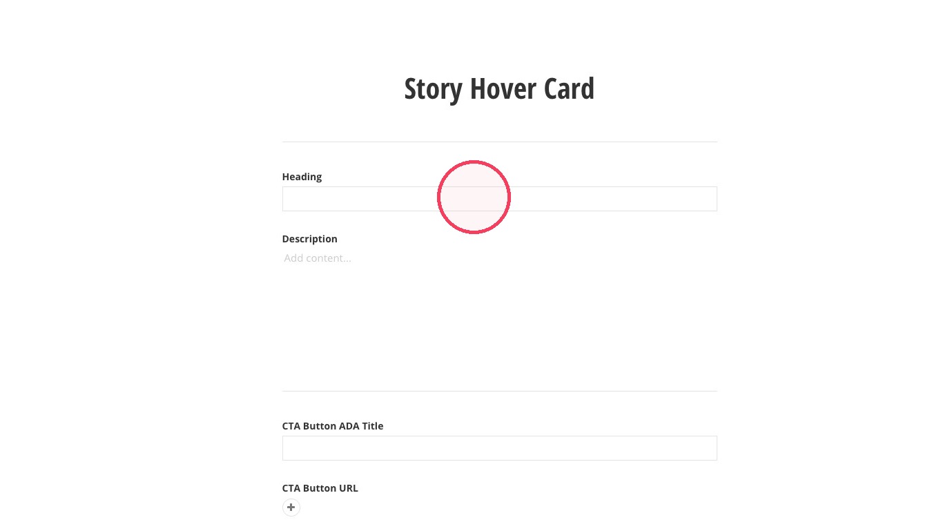
23. Add a short sentence in the Description field. Maximum characters: 75
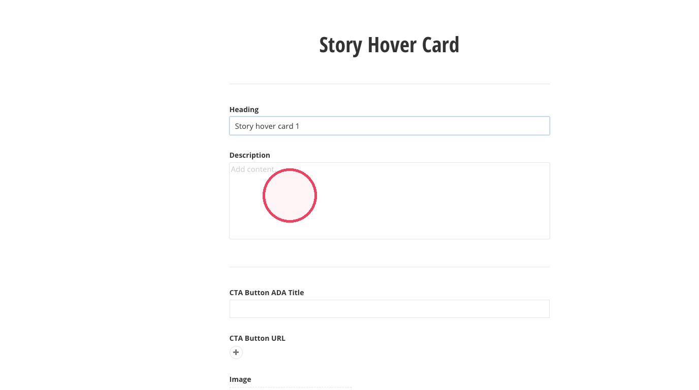
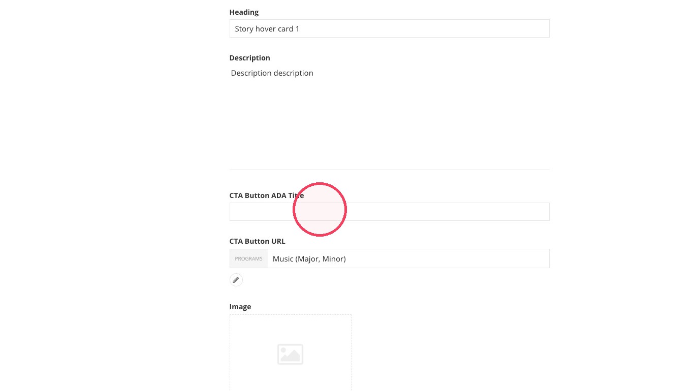
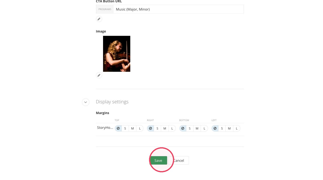
24. Click + under CTA Button URL to add a button.
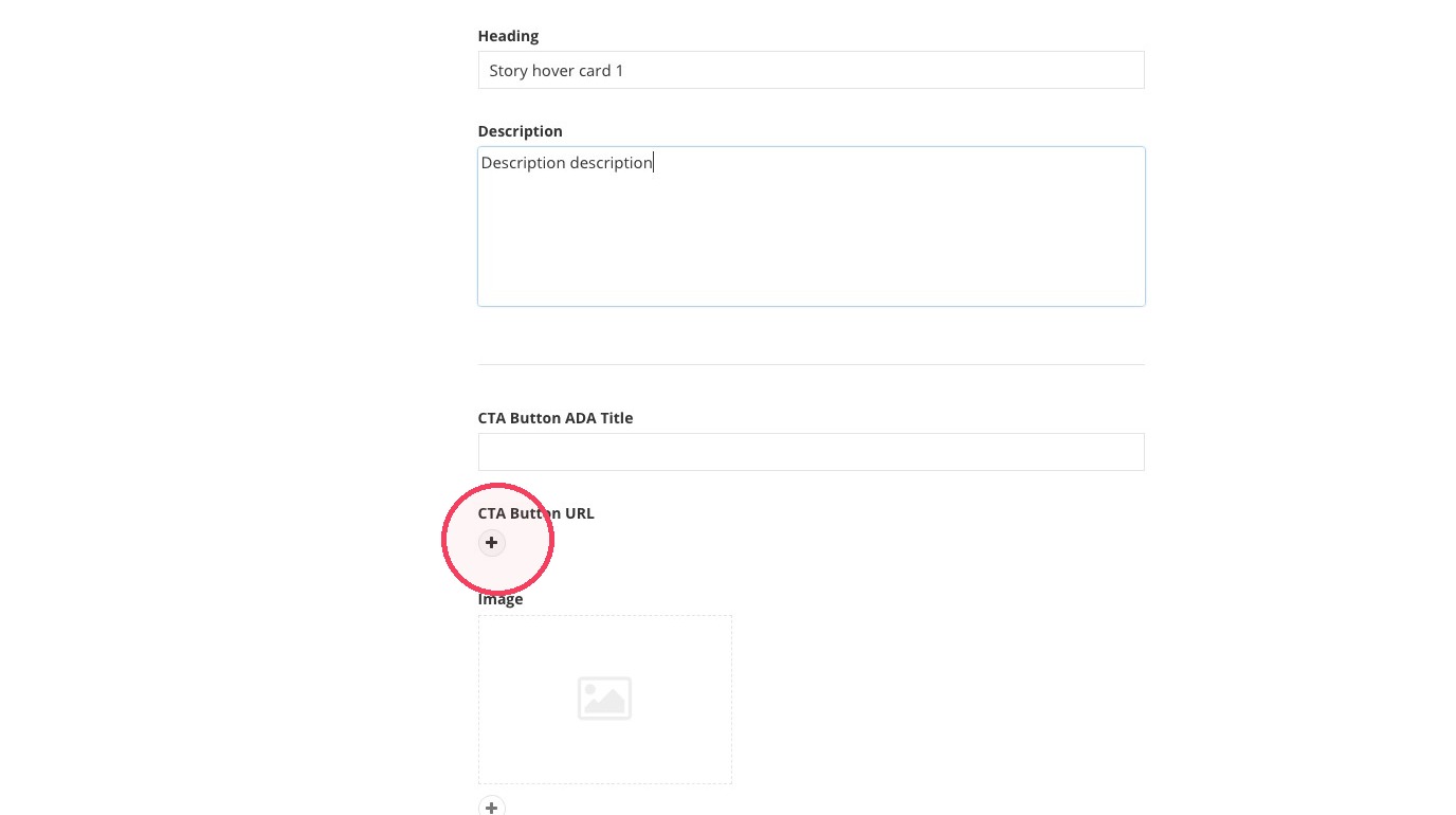
25. Click "Select page or content."
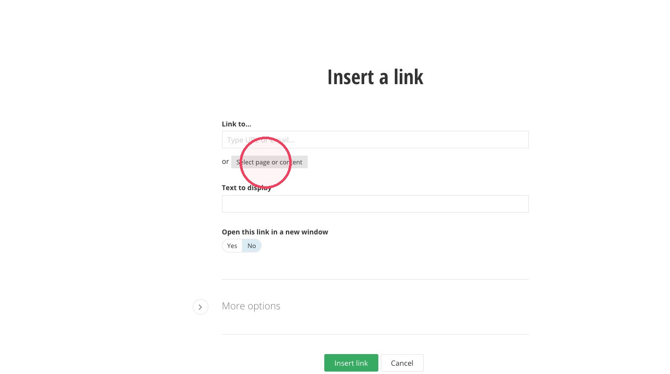
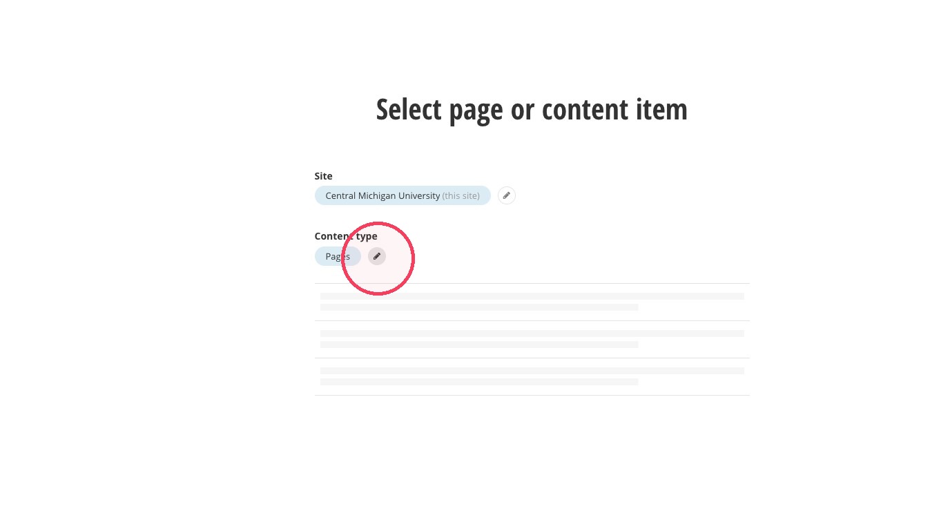
26. Click here to select your content type if you want a different type than "Pages."
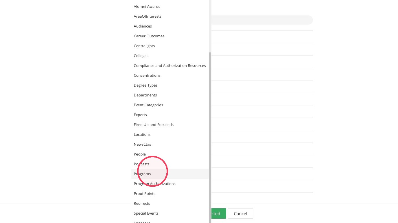
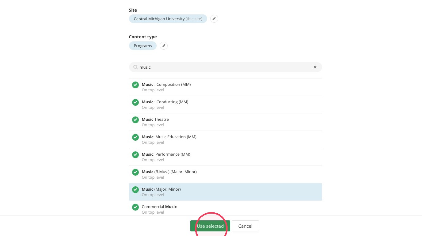
27. In this example, we use "Programs" as the content type.
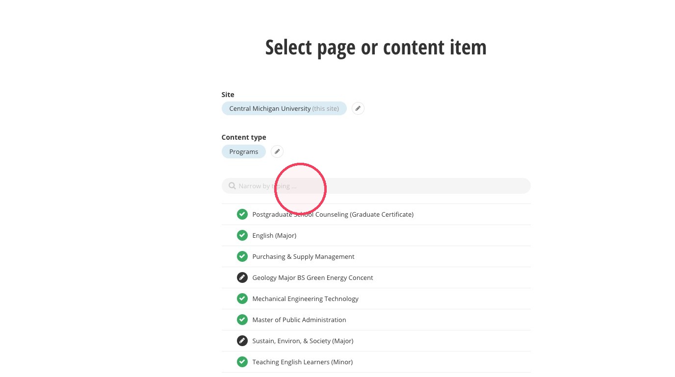
28. Click the Narrow by typing... field and search for your content or navigate through the list.
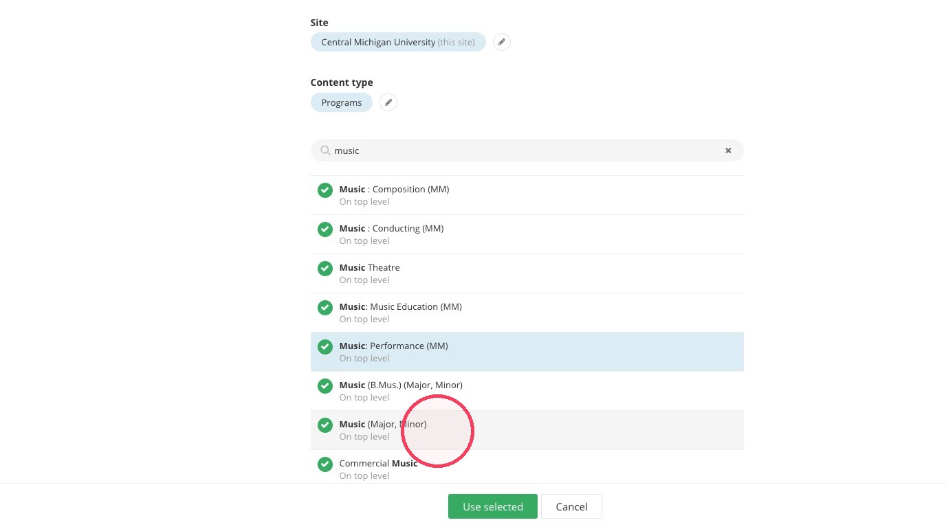
29. Select your content of choice
30. Click "Use selected"
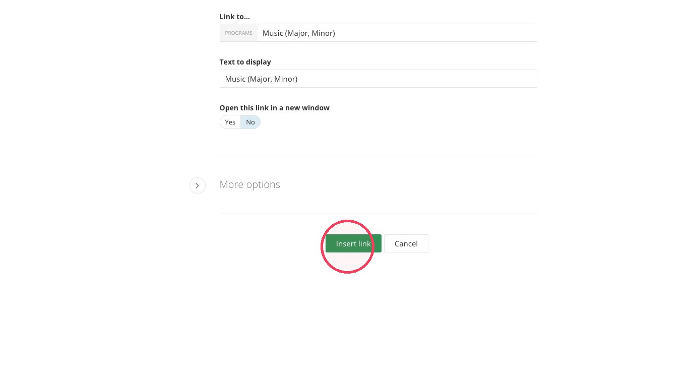
31. Edit your "Text to display" if you want it to be different than the name of the content you selected. Maximum characters: 30
Click "Insert link"
32. Add an ADA Title for your button
33. Click here to choose an image
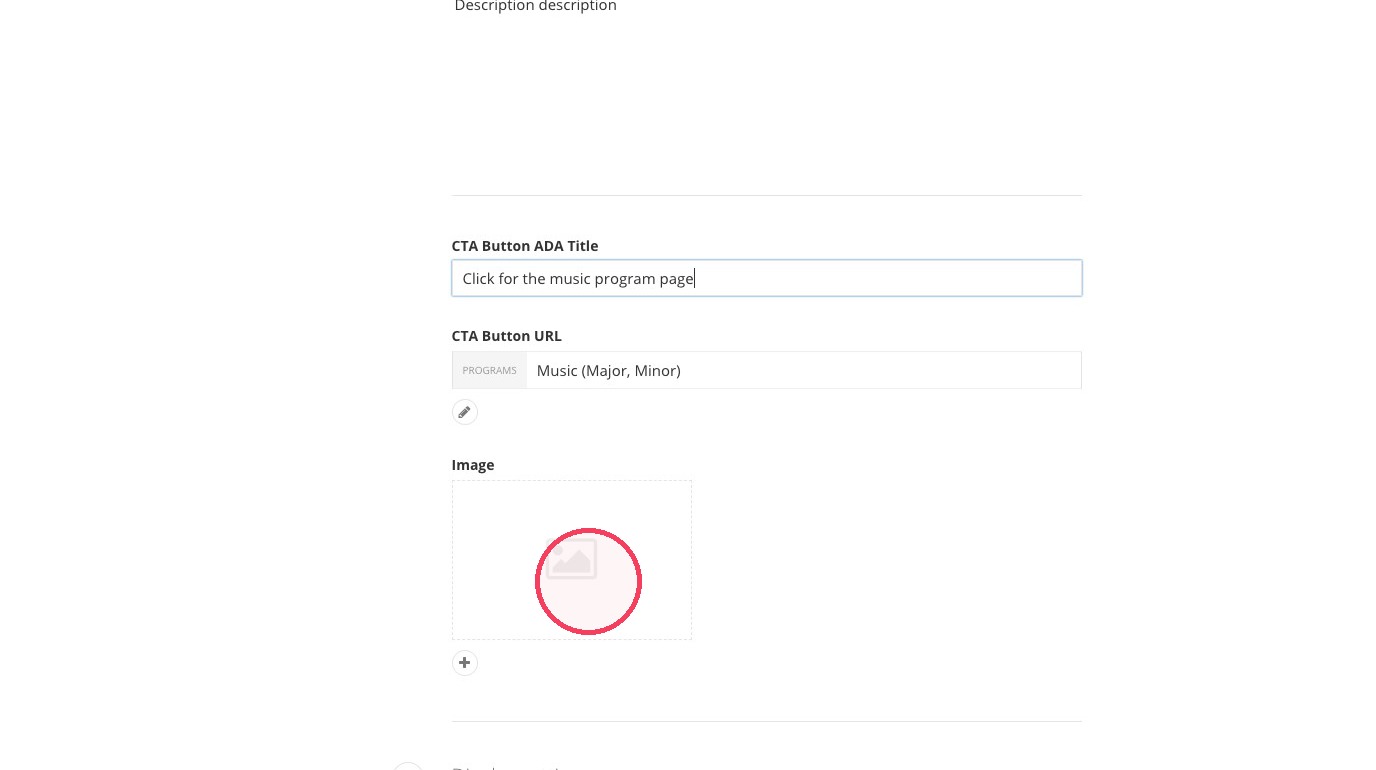
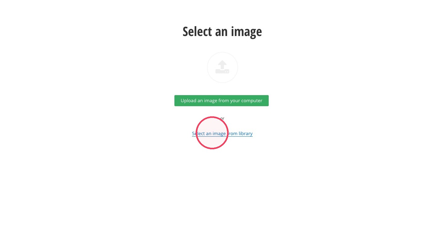
34. Click on Select an image from library.
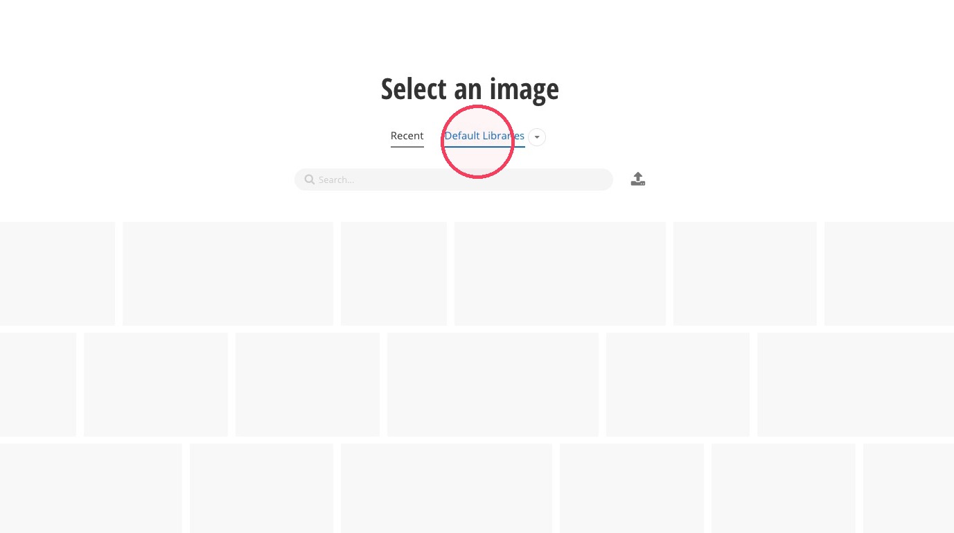
35. Click the Default Libraries option.
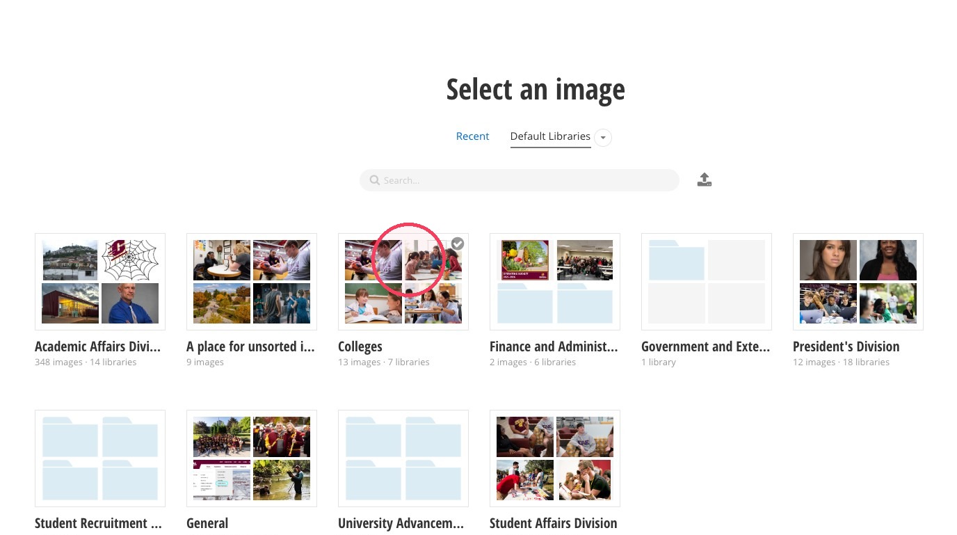
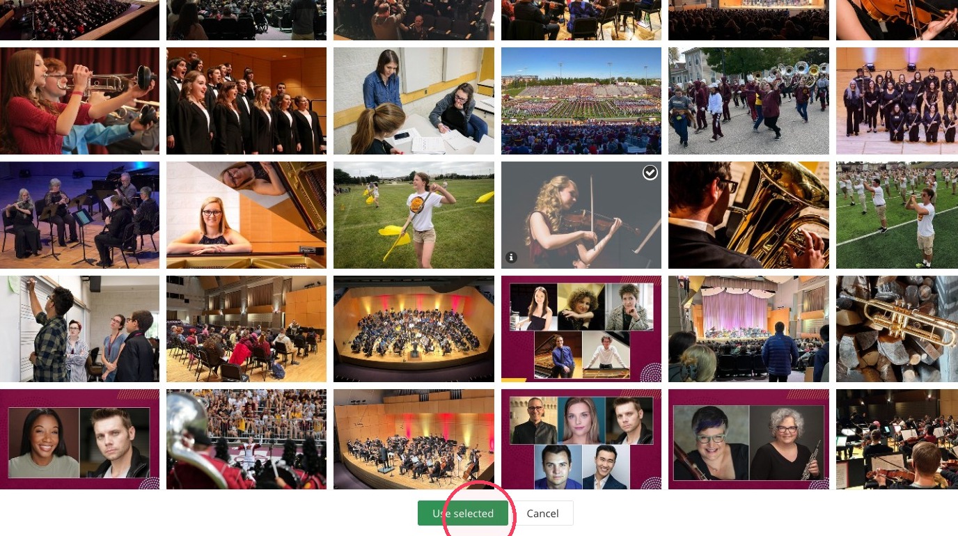
36. Navigate through the photo library or search for your image of choice.
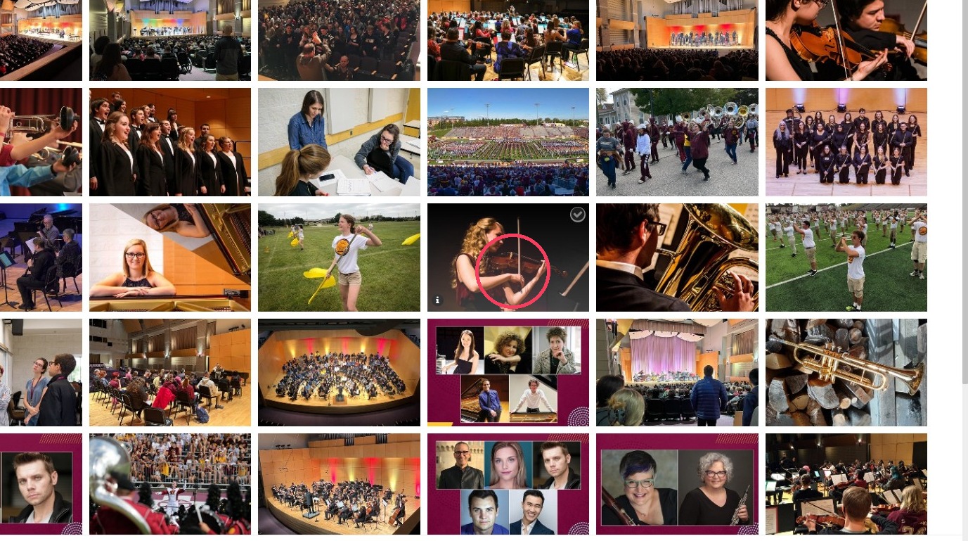
37. Select your image.
38. Click "Use selected."
39. Click "Save."
40. Add a heading, description, button, ADA text, and image to each of your story hover cards.
41. Review your story hover cards. Move the mouse over each to see the heading, description and button appear.
Save and send
- If you'd like to continue working on this page, but need to save your progress, click Save as Draft.
- If you're finished making changes to the page, and the page is ready for review, click Send for Approval.
