Tabbed Callout Slider
For use in Full-Width containers only.
The Tabbed Callout Slider widget is good to use for categories, glossaries or any time users need information on a few key topics. It features the ability to organize a list of short-form content in a small space with links and images.
Tabbed Callout Slider screenshot

Visual demo
Widget standards
A layout is needed for this widget.
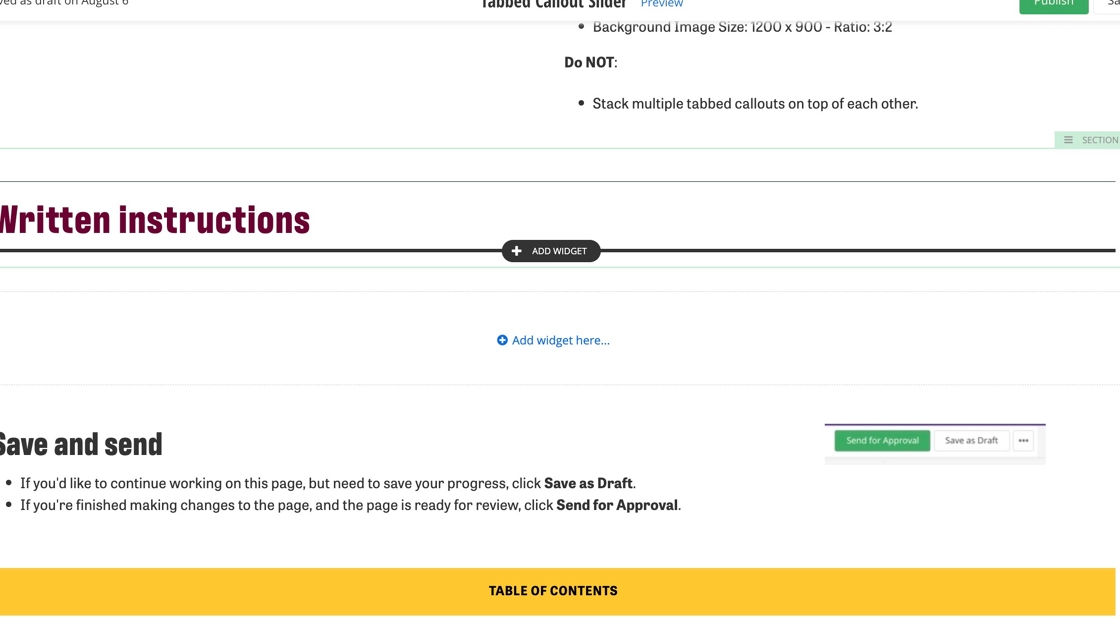
Do:
- Limited to three tabs.
- Background Image Size: 1200 x 900 - Ratio: 3:2
Do NOT:
- Stack multiple tabbed callouts on top of each other.
Written instructions
1. Open the page you want to add the Tabbed Callout Widget to.
2. Click on +Add widget.
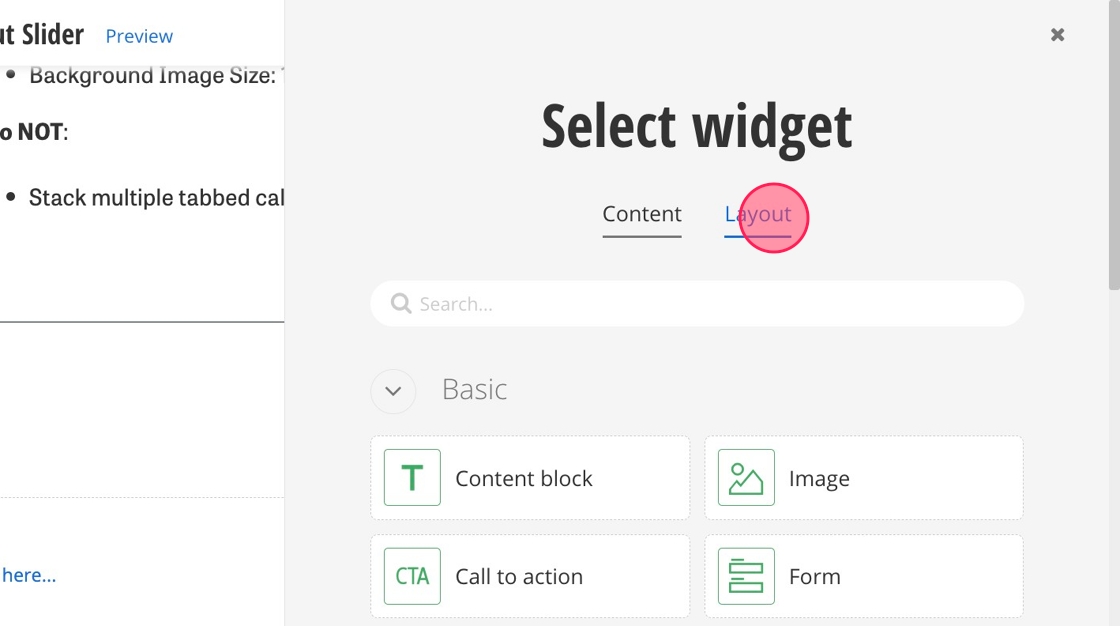
3. Under Select Widget, click on Layout.
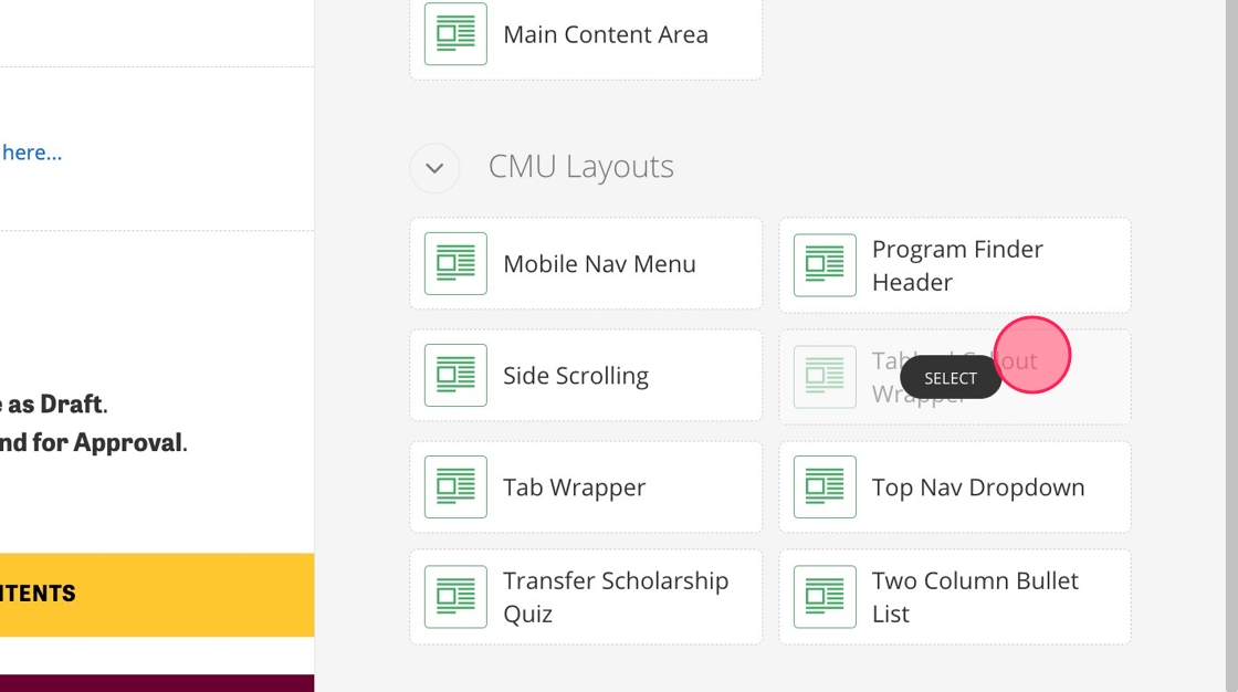
4. Find the Tabbed Callout Wrapper and select it.
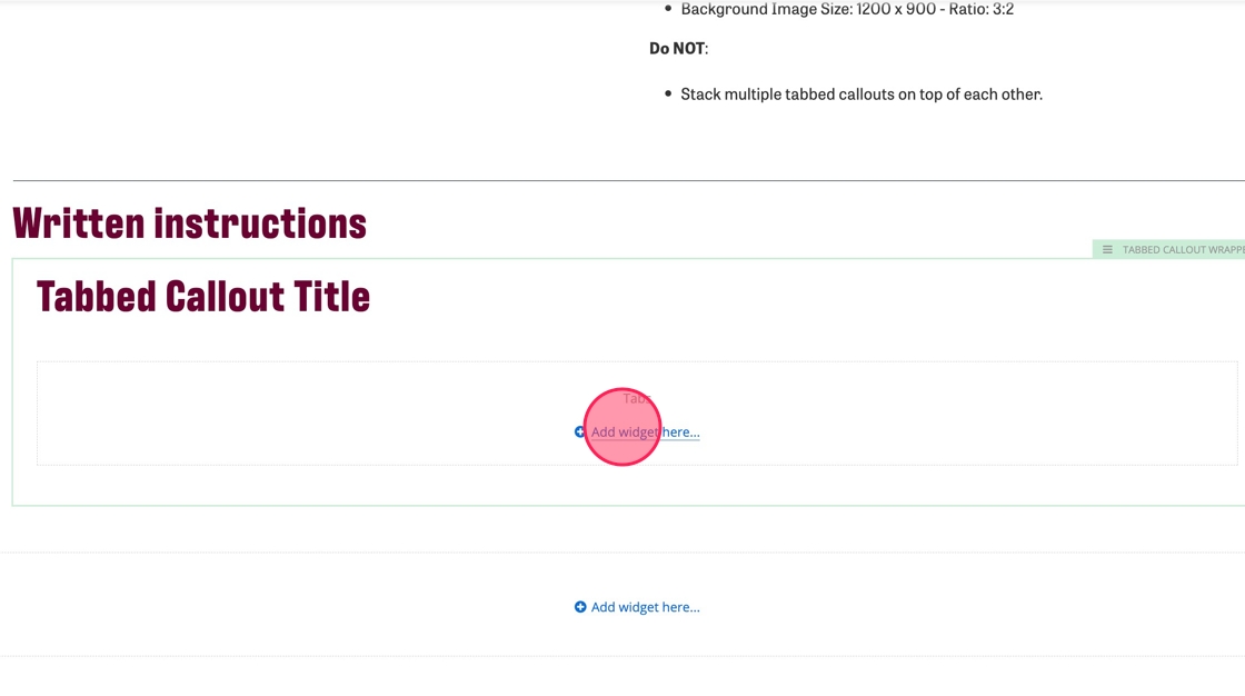
5. In the Title (H2) field, use the Content Block widget to add the title to your Tabbed Callout Slider.
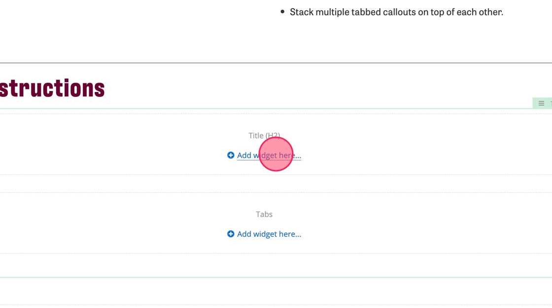
6. Add the Tabbed Callout widget into the Tabbed Callout field. You can add up to three Tabbed Callout widgets.
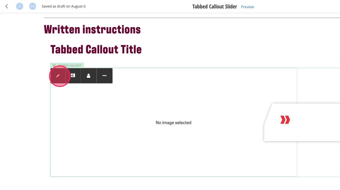
7. Click on the pencil to edit the Tabbed Callout.
8. Enter your heading text - 50 characters max.
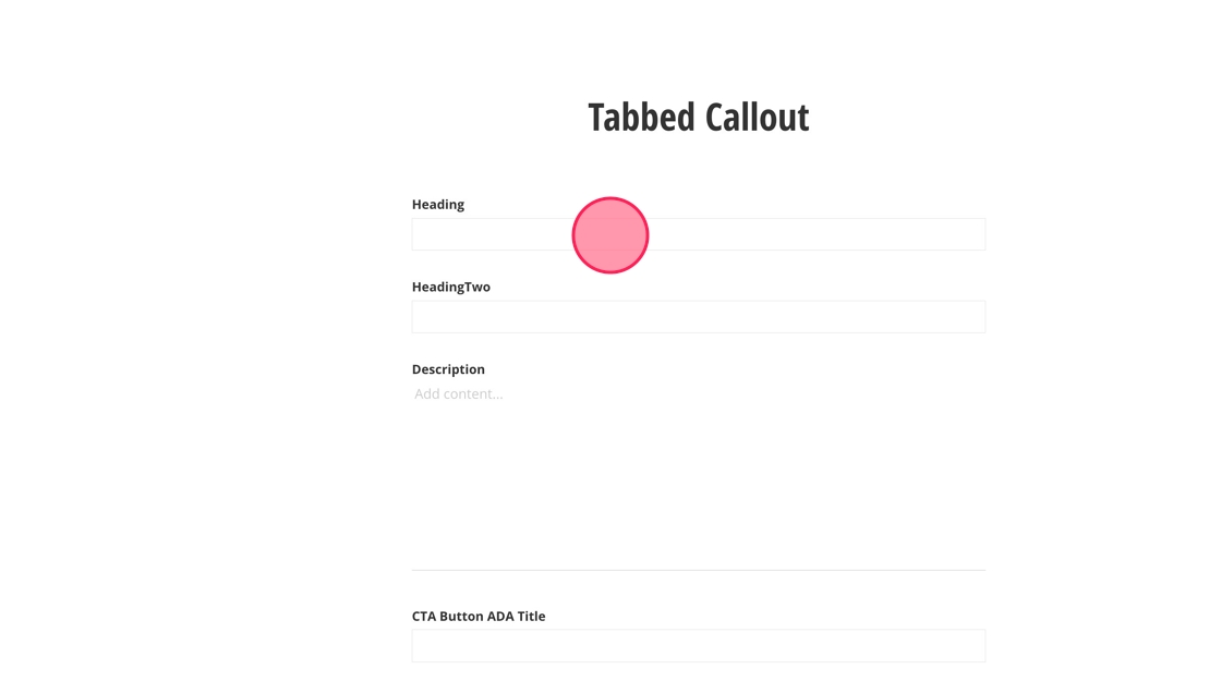
9. Enter your subheading text - 75 characters max.
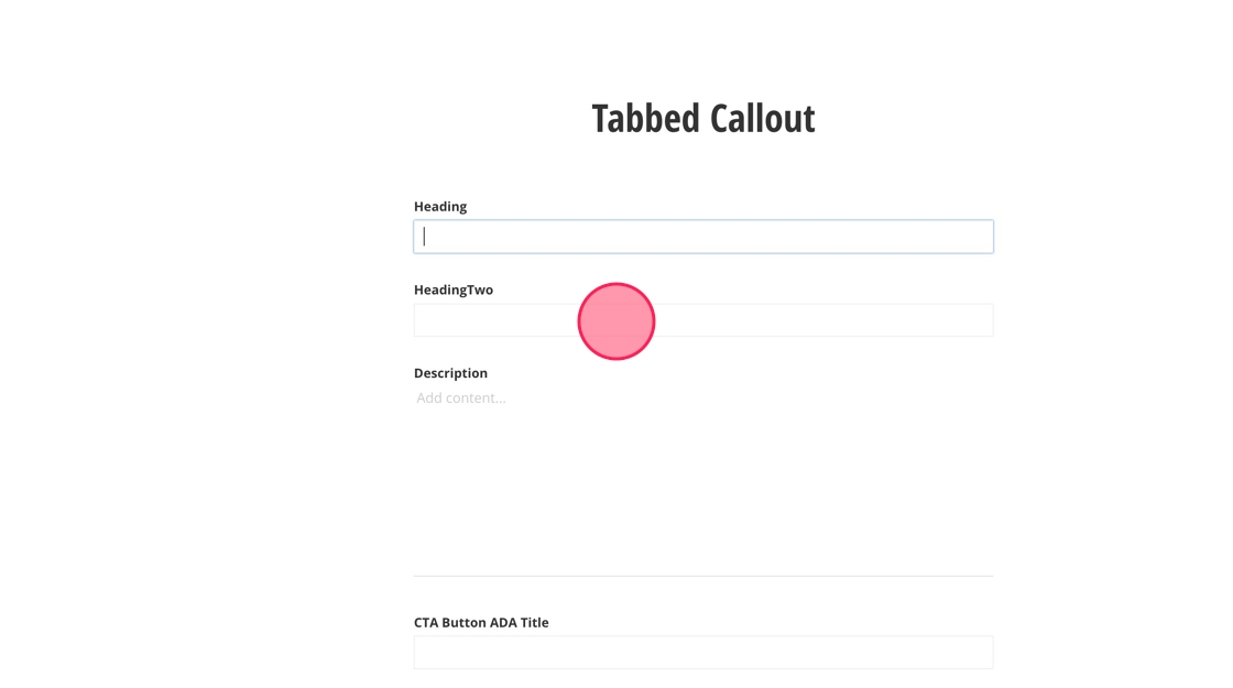
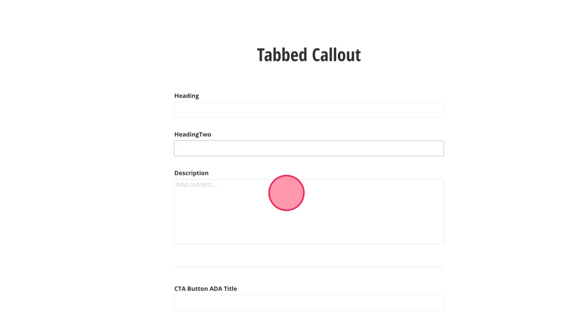
10. Add your description - 200 characters max.
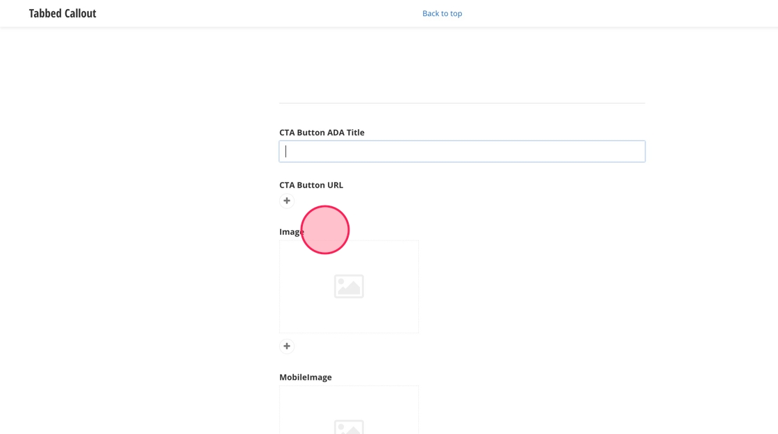
11. Select the link for your CTA and fill in the ADA text for the button. CTA should be a max of 50 characters.
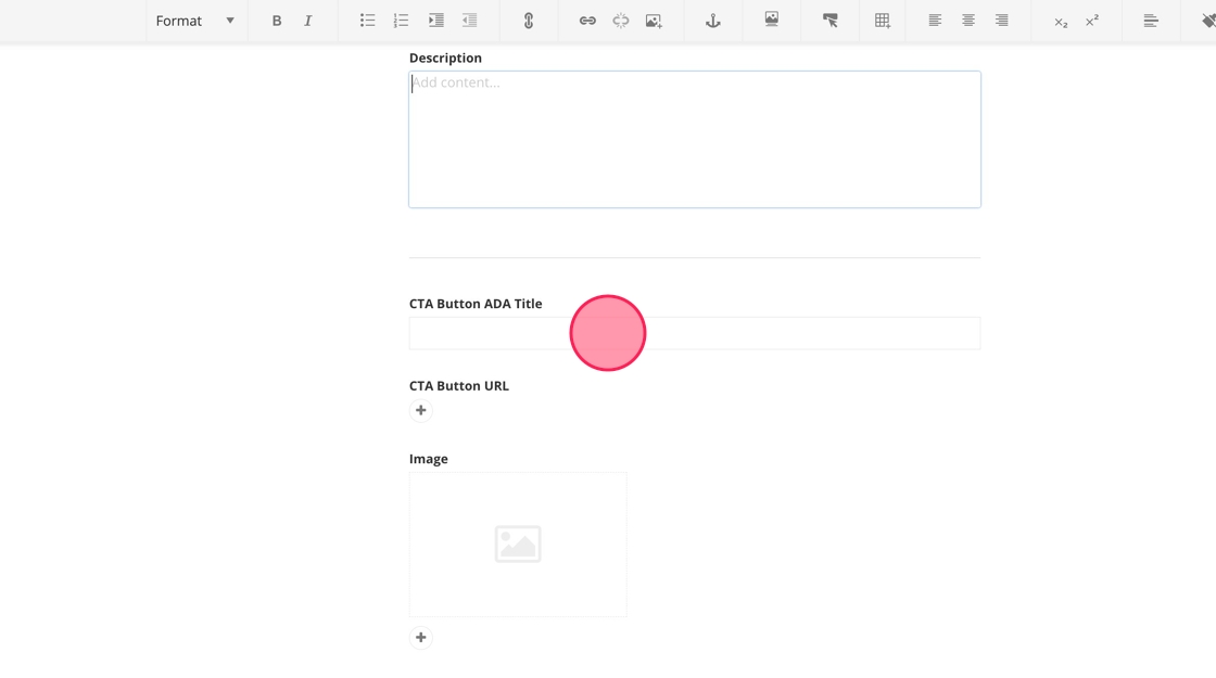
12. To add an image, click + under Image and select an image from the DAM. It should be 1200x900px.
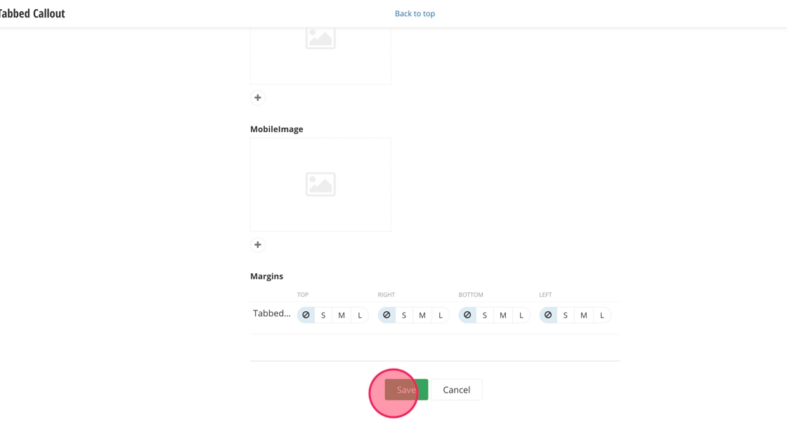
13. Click "Save".