Layouts
For use in containers of any width.
While many widgets require a layout to work correctly, there are some layouts that can be used to organize your content into columns of different widths. This is a great method to make your content more scannable and easily digestible.
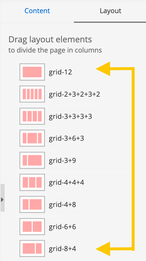
These layouts are called "Grids." You can find them grouped together under the Layouts tab. Each has an icon that gives you a rough idea of what it will look like on your page and how many columns you can expect to see.
You'll notice that these layouts are labeled "grid _ + _". The sum of the two numbers will always equal 12.
Below is an example of the grid 6+6, which splits the content area into two sections.
Best practice: Keep the length of the content in all of your grid spaces relatively the same for the best visual design.
Example grid layouts
grid 4 + 8
This is the left column of the grid 4 + 8 layout. This area could hold an image related to the content in the right column.

This is the right column of the grid 4 + 8 layout. It is wider than the left column.
grid 8 + 4
This is the right column of the grid 8 + 4 layout. This area could hold an image related to the content in the left column.
grid 3 + 9
This is the left column of the grid 3 + 9 layout.
grid 9 + 3
This is the right column of the grid 9 + 3 layout.
grid 4 + 4 + 4
This is the left column of the grid 4 + 4 + 4 layout. All columns in this layout are the same width.

This is the middle column of the grid 4 + 4 + 4 layout. All columns in this layout are the same width.

This is the right column of the grid 4 + 4 + 4 layout. All columns in this layout are the same width.

grid 3 + 6 + 3
This is the middle column of the grid 3 + 6 + 3 layout. It is wider than the left and right columns in this layout.

grid 3 + 3 + 3 + 3
In the grid 3 + 3 + 3 + 3 layout, there are four columns of the same width. This is the first column.

In the grid 3 + 3 + 3 + 3 layout, there are four columns of the same width. This is the second column.

In the grid 3 + 3 + 3 + 3 layout, there are four columns of the same width. This is the third column.

In the grid 3 + 3 + 3 + 3 layout, there are four columns of the same width. This is the fourth column.

grid 2 + 3 + 2 + 3 + 2
The grid 2 + 3 + 2 + 3 + 2 layout is broken into five columns. The columns vary in width.

The grid 2 + 3 + 2 + 3 + 2 layout is broken into five columns. The columns vary in width.