Design Standards
What are design standards?
Design standards are the principles that guide how we build consistent, clear and user-friendly web experiences. By following these standards, we create a website that looks professional, aligns with our brand, and makes it easier for users to find and act on important information.
Strong design supports accessibility, usability and trust. These standards apply to layouts, calls to action, typography, colors and more. Navigate to different sections using the links below:
Buttons and calls to action
Buttons guide users toward the most important actions on a page. To keep calls to action clear and effective, follow these practices:
- Gold buttons are reserved for the primary CTA on a page. Using more than one gold button creates confusion for users and reduces clarity.
- Maroon and white buttons should be used for secondary or less urgent actions.
- Each page should have one main action highlighted with the gold button.
Mobile-first design
Many users will visit our website on mobile devices. All layouts, images and content should be built with mobile-first principles in mind.
- Prioritize clear, simple layouts that adapt to smaller screens.
- Ensure buttons and links are large enough to tap easily.
- Keep important information near the top, where it won’t get buried on mobile.
Scannability and readability
Users often scan web pages instead of reading word for word. Use these design elements to support readability and scanning:
- Use headings, bullets and bold text to highlight key points.
- Keep paragraphs short and easy to skim.
- Avoid walls of text — break up content with spacing, subheads or visuals.
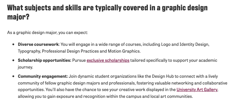
Below is a screenshot from the Graphic Design program page that showcases the correct use of bolding terms, use of bullet points, hyperlinks, etc.
Layout and patterns
Users’ eyes follow natural patterns on a screen. Design with these patterns in mind improves usability:
- Z-pattern layouts help users follow a natural flow across a page, especially with alternating content and images (image → content → image → content).
- F-pattern scanning is common on text-heavy pages — users look across the top, then down the left side. Headings and bolded text help guide their path.
- Alternate content blocks with images to create rhythm and keep attention.
Example of the z-pattern

Find your favorite study spot
Relax at our gazebo, right next to the Clarke Historical Library, which has resources available to you. Enjoy campus while you study or unwind.
Explore our downtown
Take a walk or coast on a community electric scooter downtown, float down the Chippewa river or enjoy quaint shops and great local places to eat. Take a drive along Mission Street and find big-box stores and chain restaurants. There’s something for everyone in Mount Pleasant.

Sidebars and supporting content
A sidebar is an area of a webpage—usually on the left or right side—that contains secondary information or navigation options. It often includes items like menus, related links, contact info, or calls to action that support the main page content.
Sidebars can be helpful on desktop but can create issues on mobile:
- On desktop, left-hand sidebars are highly visible and good for navigation or supporting info.
- On mobile, sidebar content is pushed to the bottom of the page. Important info in the sidebar should also be repeated higher on the page.
- Avoid placing critical CTAs or deadlines only in the sidebar.
Example screenshot: A program page with a sidebar on desktop showing contact/important info, and the same info is pushed to the bottom for mobile users. Here is the link to view the Accounting program page to visually see the difference. As you can see, the sidebar content is relocated.

